Case Study

Synergy - the new CreditBook Design System

When CreditBook shifted from a B2C budgeting app to embedded financing for consumers, Financial Institutions (FIs), and banks - I led the creation of Synergy, a coherent, code-backed design system. I audited four live products, prioritized shared components, defined brand-to-product foundations, built a research-backed pattern library, synthesized page layouts, and ran a 2-phase handoff with engineering to ship a React implementation.
ROLE
- Lead designer and owner of the Design System (strategy → delivery → rollout).
- Created brand-to-product translation (type, color, density, tone).
- Partnered with engineering on a React component library and icon strategy.
- Drove cross-functional adoption and governance.
TIMELINE & STATUS
2 Months, Handed off in August 2024
Impact
Significant improvement in operations
1. Faster design-to-dev delivery for new UI (measured by PR cycle time + design ticket throughput).

2. Reduction in UI bugs related to inconsistencies and spacing.

3. High component reuse across FI Book, Partner Book, Credr (LMS), and Embedded Financing.

4. Designers reported hours saved per feature on average simply by pulling patterns + tokens.
Context
Why this project mattered?
CreditBook was rebranding and repositioning from an everyday budgeting tool to embedded finance. The audience moved from casual users to operators at banks, financing institutions, and partners. Our UI needed to feel refined, professional, and trustworthy, and our process needed to help design, engineering, and PM ship faster with fewer debates about basics.I framed Synergy as both a product (tokens, components, documentation) and a process (how teams work together around those assets).

I framed Synergy as both a product (tokens, components, documentation) and a process (how teams work together around those assets).
Audit
Get the truth on the table
We had four different products in active use (LMS → Credr, FI Interface → FI Book, Partner Interface → Partner Book, White Label → Embedded Financing). Each carried legacy “concept/MVP” choices.

What I did:
1. Captured a visual inventory of every component used across products (lots of screenshots).
2. Labeled each by function, variants, and usage frequency.
3. Logged inconsistencies (padding, states, labels, color semantics, icon choices).

This produced a single source of truth for what we actually shipped—not what we wished we shipped.
Prioritization
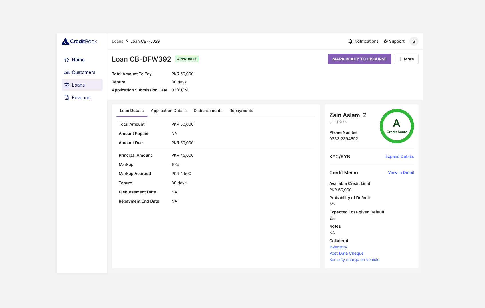
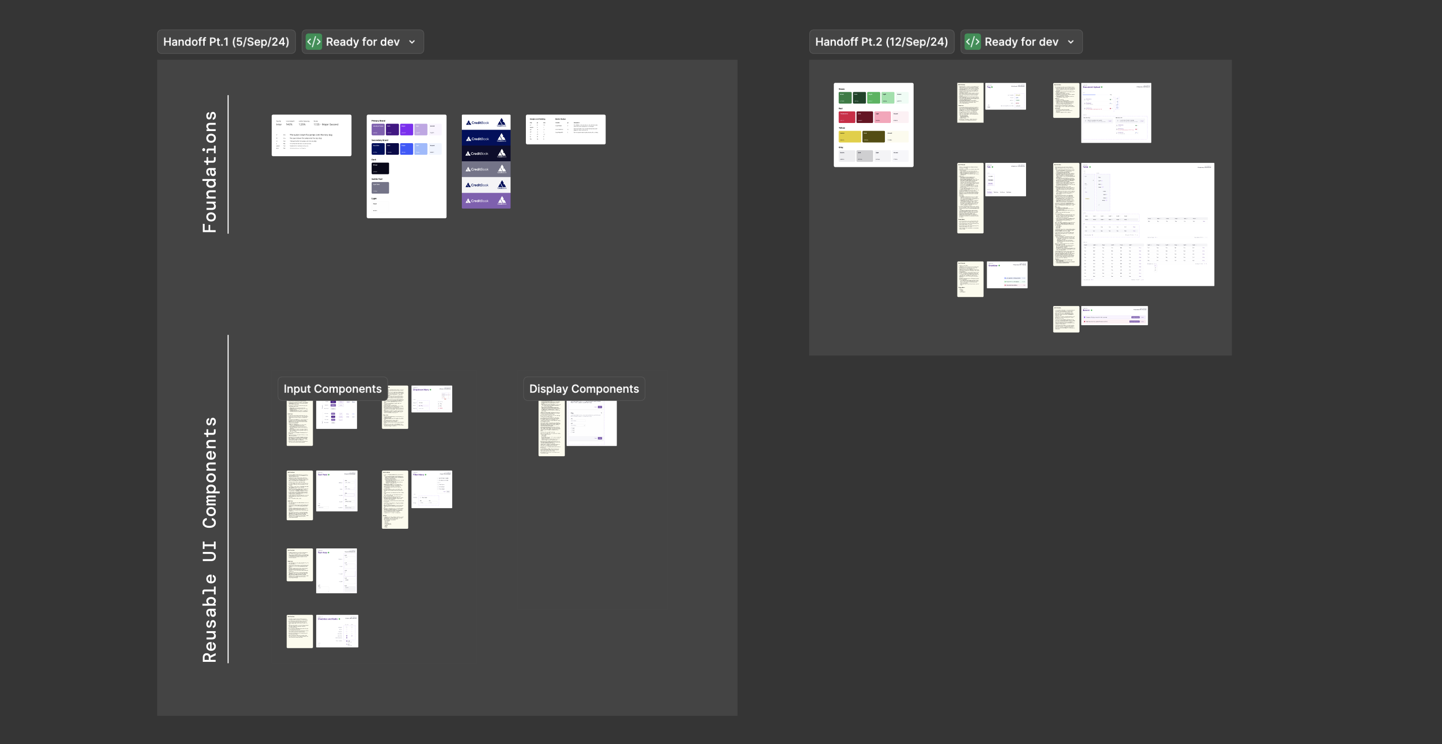
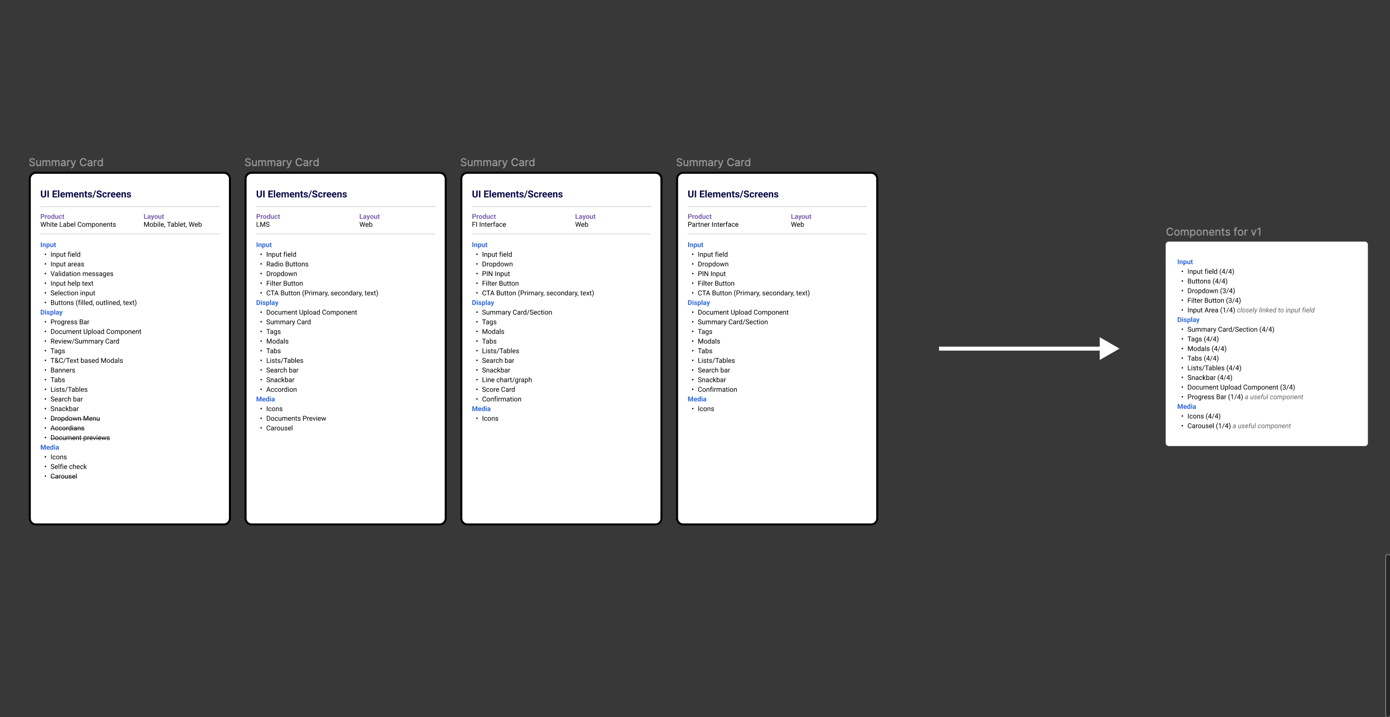
Build the right things first
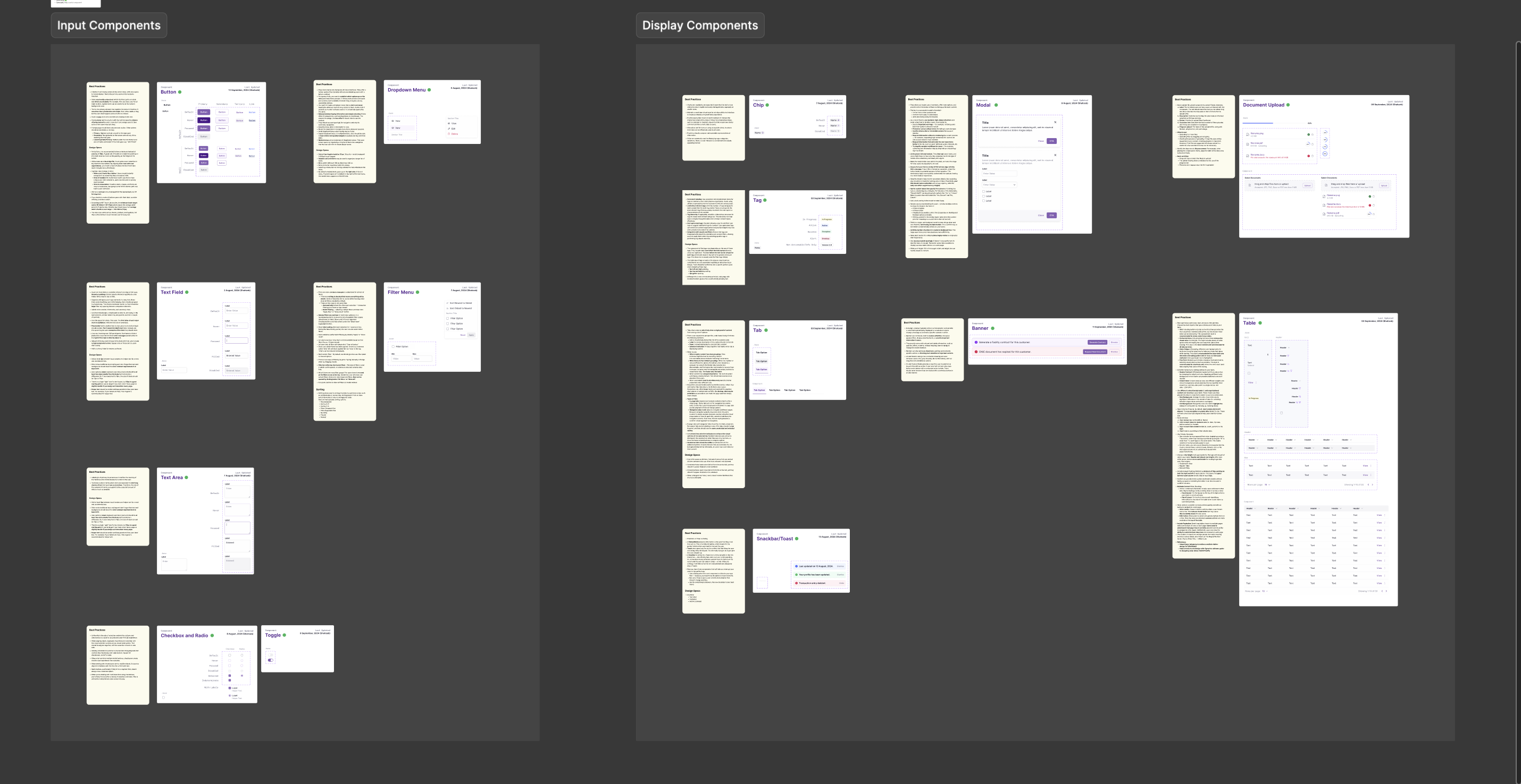
From the audit I shortlisted cross-product, high-frequency components and ranked them by recurrence + complexity:

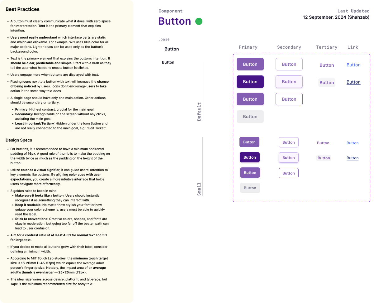
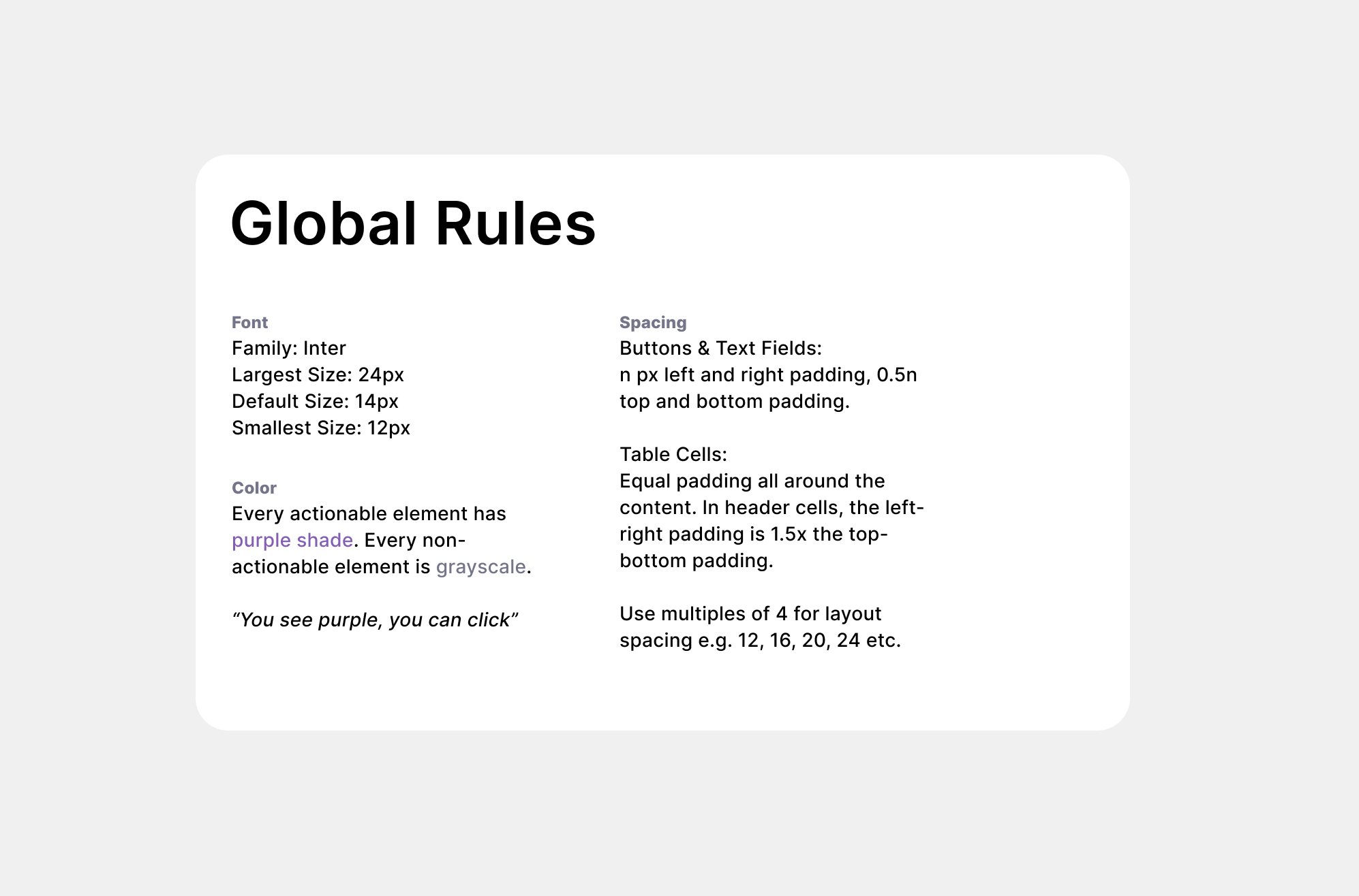
1. Inputs: text fields, buttons, dropdowns, checkbox/radio, filter menus, text areas.

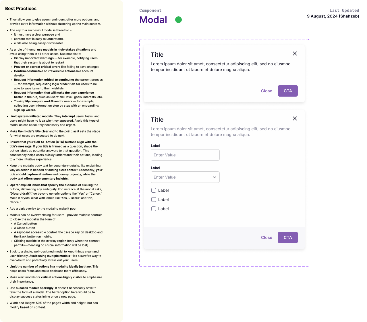
2. Display: tags/chips, modals, lists/tables, tabs, snackbars/toasts, banners, document upload, progress bars, summary cards.

3. Media: icons (standardized), document previews where relevant.

This gave me a v1 roadmap - a pragmatic sequence that would maximize immediate reuse and unlock the fastest wins for engineering.
Foundations
Brand → Product Tokens
I work with Brad Frost’s atomic model.

We already had a brand system (which I helped shape), but it needed product-grade decisions:
Typography: Inter. Default size 14px.

I backed this with a competitive audit of enterprise fintech/SaaS dashboards (Unit, Jira, Airtable, etc.). 14px balanced readability and density for professional tools.
Color semantics: “You see purple, you can click.” Actionable = purple family; non-actionable = grayscale. Clear affordances, fewer “is this clickable?” questions.

For the naming of tokens - I used this excellent guide from Nathan Curtis on Medium.
Spacing: 4px grid. Buttons/inputs: n px left/right, 0.5n top/bottom; tables use equal padding with header cells at 1.5× horizontal padding.

Elevation & radius: restrained; professional, not ornamental.
Icons: after discussions with engineers, I standardized on Phosphor - good weight control, React-friendly, consistent visual language.

All tokens shipped with WCAG AA contrast rules and examples.
Pattern Library
Research-backed, not just pretty
I didn’t want “just a Figma sticker sheet." Each component spec includes best practices (evidence-based guidance, do/don’t, interaction patterns).

States (default, hover, focus, disabled, error, success).

Accessibility (hit areas, focus order, label rules, contrast minimums).

Design specs (padding, sizing, motion where used).

Rationale (why this pattern over alternatives).
Examples
Buttons: hierarchy and text-first labeling to remove ambiguity; min horizontal padding 16px; contrast ≥ 4.5:1.

Text fields: label/title case conventions; helper text vs. placeholder guidance; error placement; 4px label/input spacing.

Dropdowns & Filters: keyboard support, menu width rules, nested menu behavior, debounce vs. batch apply.

Checkbox/Radio/Toggle: consistent sizing; indeterminate state when lists can be partially selected.

Table: dense vs. relaxed modes; sticky headers, sorting, row affordances, mobile overflow strategies; pagination guidance.

Document upload: drag-and-drop, progress feedback, error and limit messaging, multi-file states.

Snackbar/Toast vs. Modal vs. Banner: decision tree for interruptive vs. confirmational vs. ambient messaging.

This “why” content was crucial for PMs and engineers, not just designers.
Layout System
How the parts come together
After components were stable, I worked with other designers and our Head of Design to answer the big question:

card-based vs. flat?

We explored both, ran competitive passes, and stress-tested against typical FI workflows:

(customers → loans → applications → disbursements → repayments).
Decision
Predominantly flat pages with clear information, and contained cards only where information truly benefits from scannable blocks (e.g., right-rail credit summary).

Standardized page scaffolding: global header, left nav, page header (title + meta + primary actions), content zones with predictable spacing, and optional right rail for at-a-glance KPIs.

The result: cleaner focus, fewer competing elevations, and better data density without feeling heavy.
Handoff
Designs, code, adoption
Given the scope, I split handoff into two parts:

Part 1 — Foundations + Inputs
Design tokens (type, color, spacing), icon guidelines.Inputs set with full states and docs.

Part 2 — Display + Layout
Tables, document upload, tags/chips, modals, snackbars, banners, tabs.Page templates and layout scaffolds.

How we made it stick
- Engineers built a React component library.
- I provided examples from real screens as needed to ensure design-to-code parity.
- We set versioning + change logs.
- Created a contribution model: propose → review (design + FE) → accept → document → release.
Outcomes
Sometimes boring is best
I left the company for my Master's a few months after handoff so I couldn't see the entire impact of this project. But I did collect feedback from my colleagues later.

Speed: Average feature UI moved from concept → PR in less number of days. Designers pulled templates, PMs referenced decision trees and rationale, engineers dropped in pre-built components.

Quality: Fewer UI bugs tied to spacing, states, and semantics. Most “is this clickable?” comments disappeared after the purple-for-action rule landed.

Consistency: High reuse of components across FI Book, Partner Book, Credr, and Embedded Financing. Removed or merged 33+ duplicate patterns from legacy work.

Onboarding: New designers reached “productive in the system” in 1 week vs. 3–4 previously.

Stakeholder confidence: Sales demos and partner pilots explicitly called out the polish and clarity of FI tooling.
Final Thoughts
A few decisions I’m glad I fought for
14px base size for professional dashboards: validated with a competitive scan, not taste. It kept density high without sacrificing readability.

“You see purple, you can click”: one line that clarified affordances for everyone.

Phosphor Icons: unified style + painless React integration = fewer one-off SVGs and faster build time.

Documented rationale everywhere: future-proofed debates and made tradeoffs transparent.
Next Steps
What I would've improved next
Design tokens → theme packs for white-label partners (brand swaps without custom code).

Analytics on components (usage + friction points) via Storybook + product telemetry.

Building Synergy wasn’t only about unifying pixels; it was about engineering a shared way of working. By grounding every decision in usage frequency, research, and feasibility, I helped the org move faster with more confidence - across design, engineering, and PM.

In a finance context where trust and clarity aren’t optional, Synergy gave us both.
See Next Project
Invoice Creator
Links:
© 2025 Shahzeb Kazmi. All Rights Reserved.