How to redesign a popular yet faltering feature into a seamless & powerful tool?
Ordr Invoicing 2.0 is a game-changer for business operations. With a streamlined, intuitive interface inspired by the best in the market, users can now generate invoices 120% faster. I led the problem definition, solution ideation, and design of the update.
- Product
- Ordr (CreditBook)
- Industry
- FinTech / B2B SaaS
- Role
- Lead Product Designer
- Timeline
- 2 months, shipped November 2023
- Team
- Khadija Shahab (PM), Avinash Kumar, Karan Kapur (Eng), Danial Imtiaz (QA)
Overview
A Rising Star with Growing Pains
Imagine trying to run a marathon with a sprained ankle. That is what our users felt when generating invoices using Ordr's invoicing module; it was slow and painful.
In May 2023, Ordr was launched, and within just three months its invoicing module became a hit among users. The popularity, however, brought a number of requests for enhancements and fixes, which were addressed in a patchy manner through updates from different developers. Over time, this piecemeal approach led to significant performance and design issues, causing the module to deteriorate with use.
Problem
The Need for a Holistic Redesign
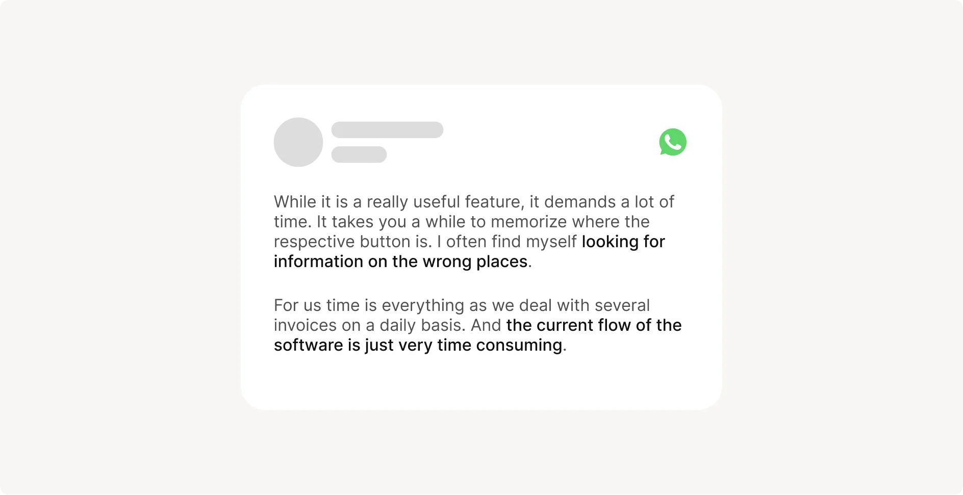
Data doesn't lie, and neither do dozens of complaints and requests from customers.
I recognized early that the existing bento-box styled design was not scalable; it was getting harder and harder to introduce requested features. Each patch update exposed its weaknesses further. A comprehensive redesign was necessary to restore and enhance functionality and user experience.
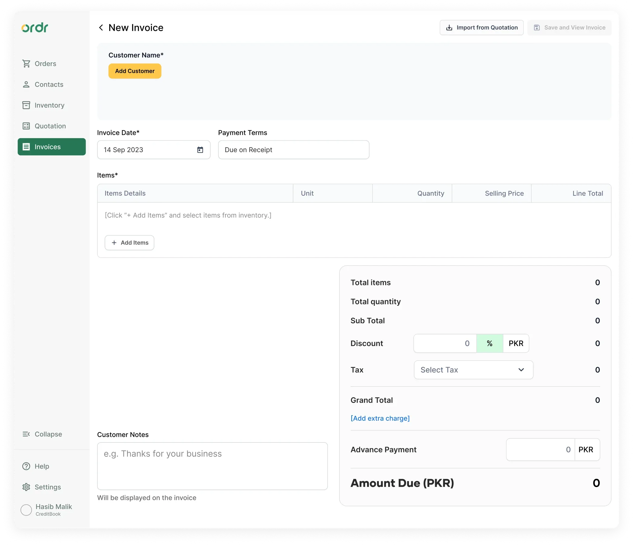
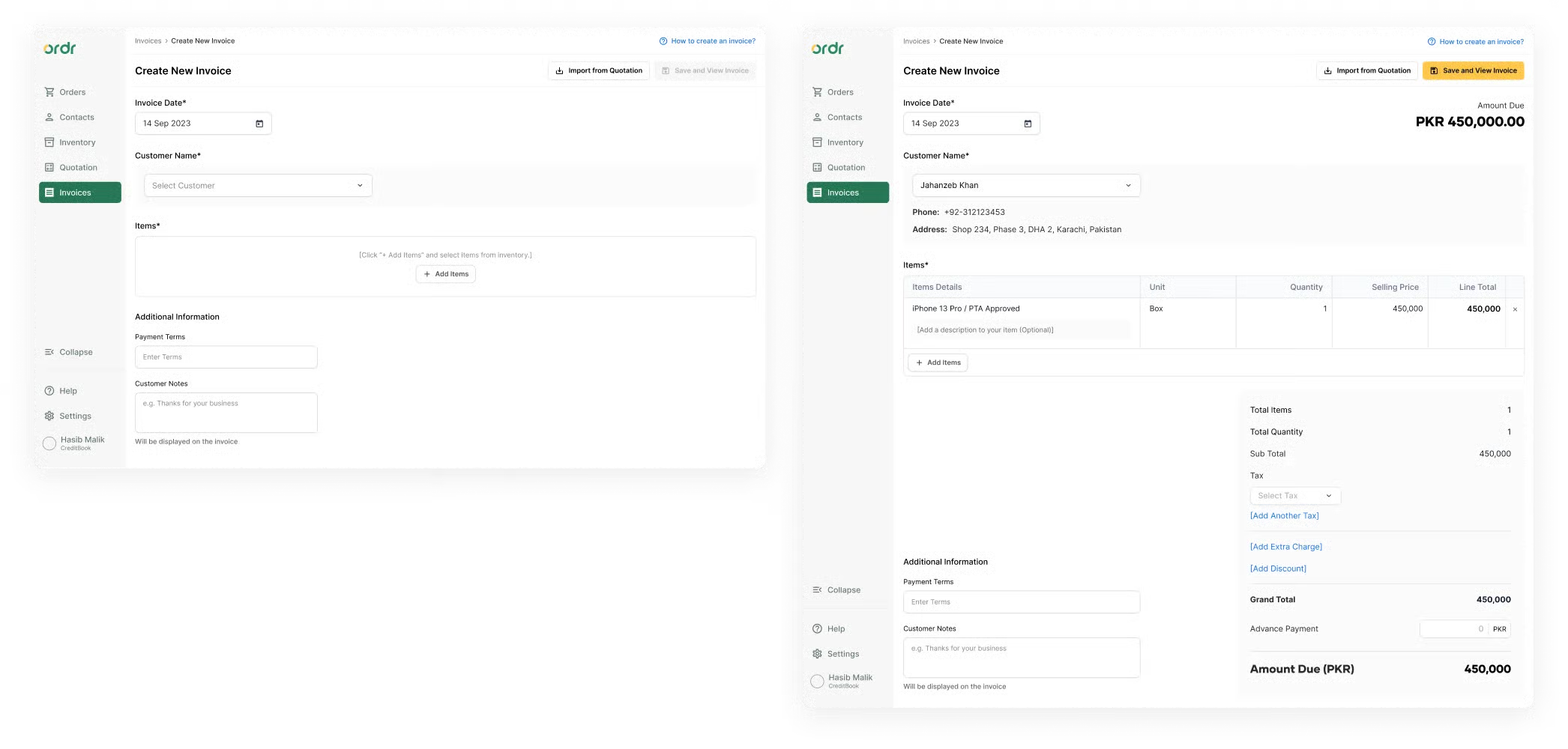
Before
Before
Analysis
Building the Case for Change
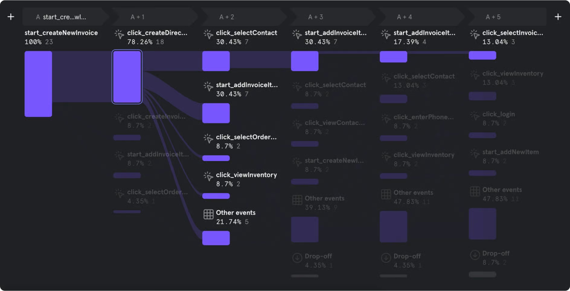
I began by building a strong case to present to PMs and Team Leads using data from Mixpanel. I illustrated the inefficiencies in the current invoicing process: the average time it took users to build an invoice and the confusing, unintuitive interaction flows.
I also cataloged user feedback, capturing quotes that underscored their frustrations with performance and design flaws. Armed with solid rationale and the backing of the engineering team, who were eager for an opportunity to refactor the code, I pitched the need for a holistic redesign.
Goals
Making Ordr Invoicing Best in Class
1. Enhance scalability and performance. Address the deteriorating performance and scalability issues caused by the initial bento-box design and ad-hoc patch updates.
2. Improve user experience. Create a more intuitive and efficient invoicing process by incorporating user feedback and aligning with industry best practices.
3. Streamline workflow. Design a step-by-step, user-friendly interface that accommodates the workflows of most users and makes it easy to add features in the future.
Design
Crafting the Perfect Experience Over Many Iterations
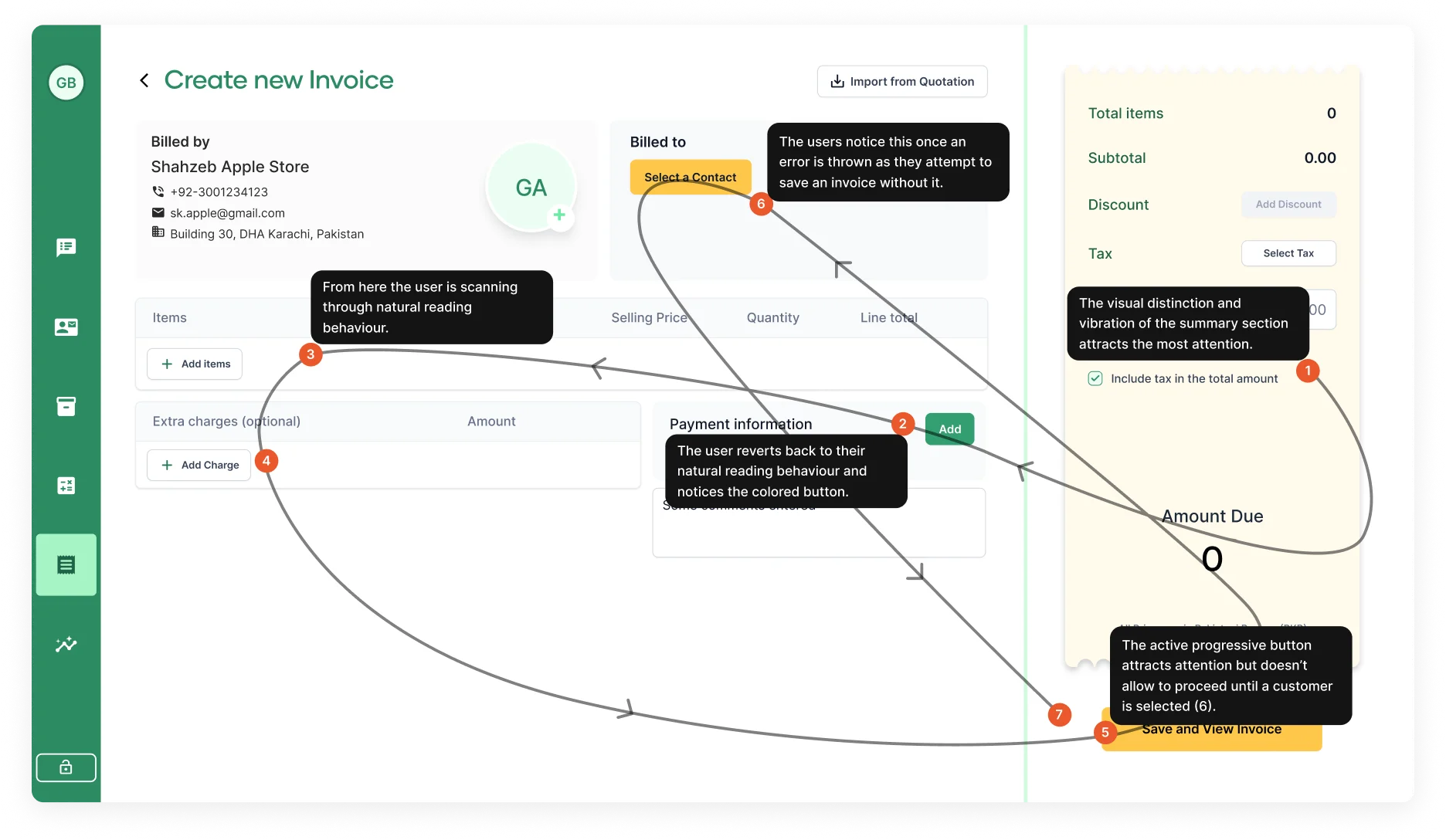
With these insights and a clear understanding of the problem, I set out to design an experience that was simple yet powerful: a layout that offered increasing functionality as the user progressed through their workflow. After five iterations, I reached a final design that addressed user problems, aligned with business goals, and facilitated future feature additions.
Iterations (scroll to see all)
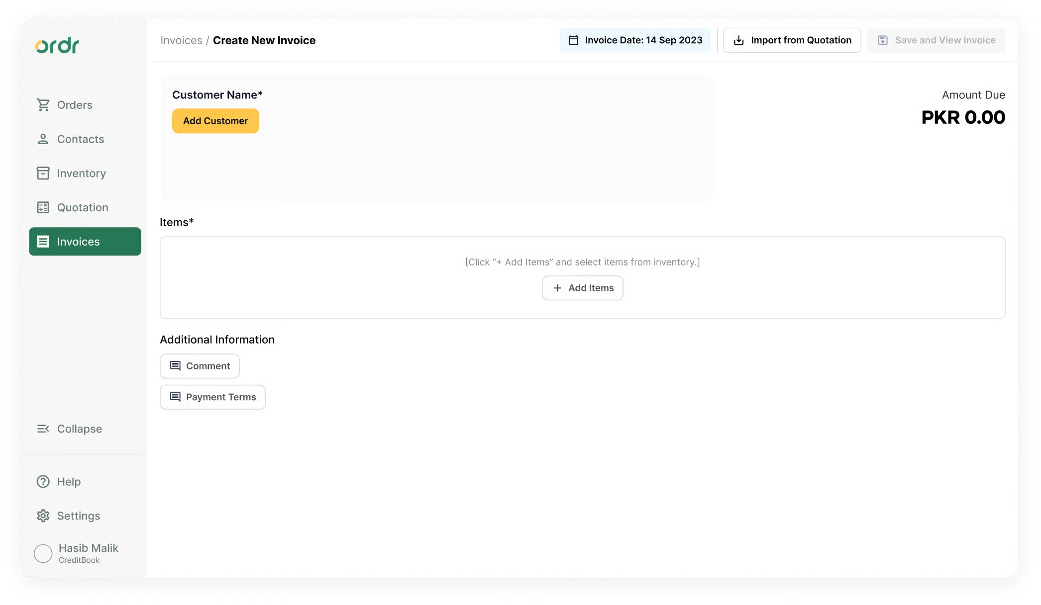
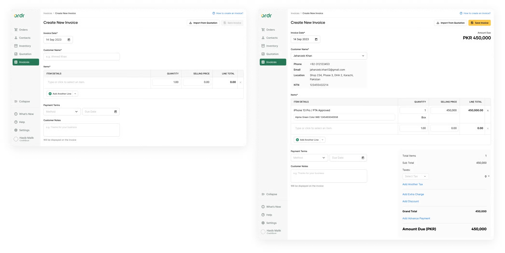
1st iteration
I focused on improving the flow of interactions by laying out the different sections in a linear manner with clear labels. I was mainly driven by competitor studies and followed their patterns of information hierarchy, e.g. placing Payment Terms at the beginning beside Invoice Date.
2nd iteration
When I tested the first iteration with design partners and other designers, I observed a default flow emerging where users first added a customer and then progressed. I repositioned the invoice date and terms fields because almost all users skipped them, signaling relative insignificance. This is where I started to part ways from competitor insights.
3rd iteration
With the second iteration, I de-emphasized the invoice date and terms inputs quite a lot. Interestingly, the same users who previously skipped them began looking for those fields. This taught me: even if they don't want to change a value, users want those fields visible and easily accessible. I also introduced gamification, e.g. the summary card only unlocks after they add their first item.
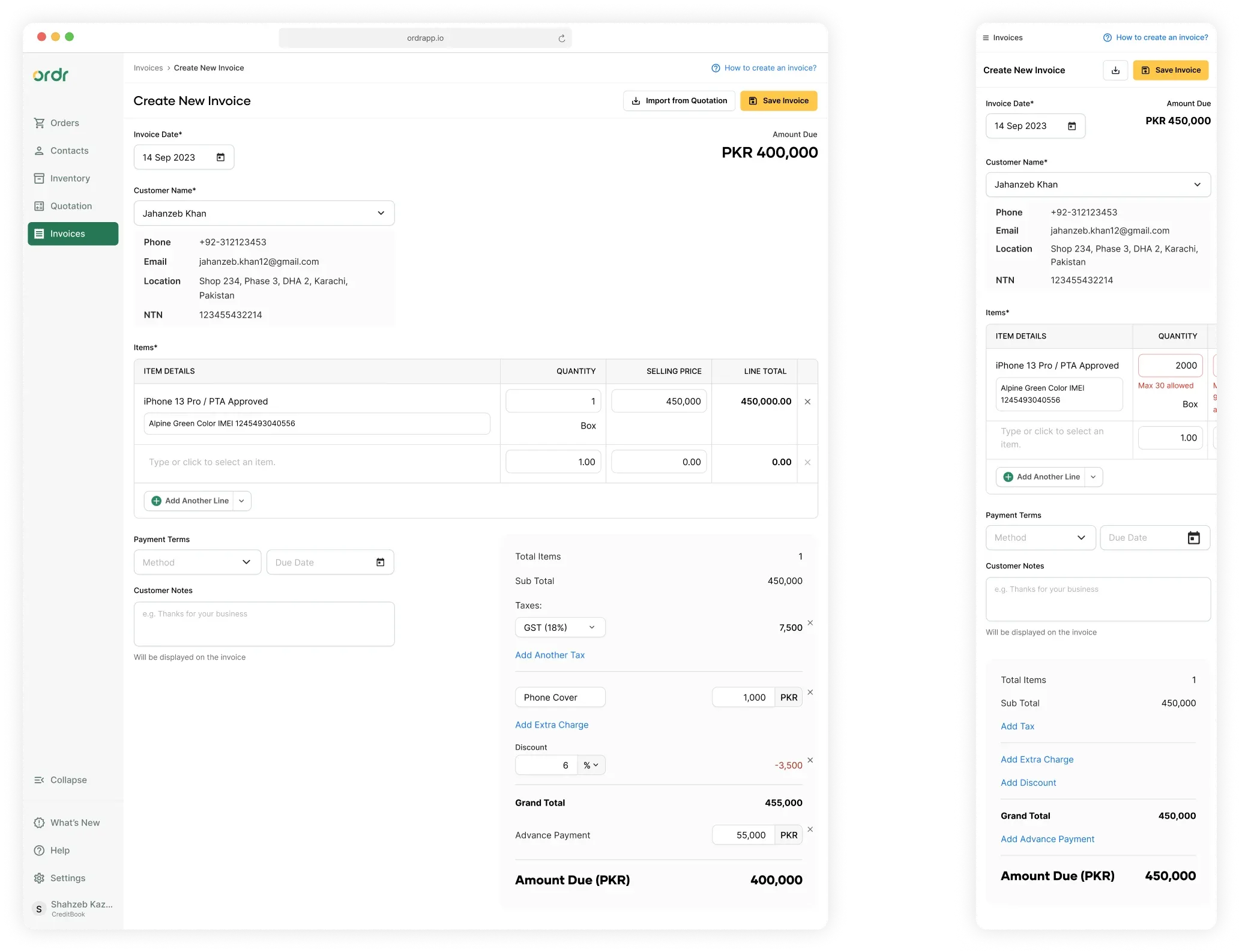
4th iteration
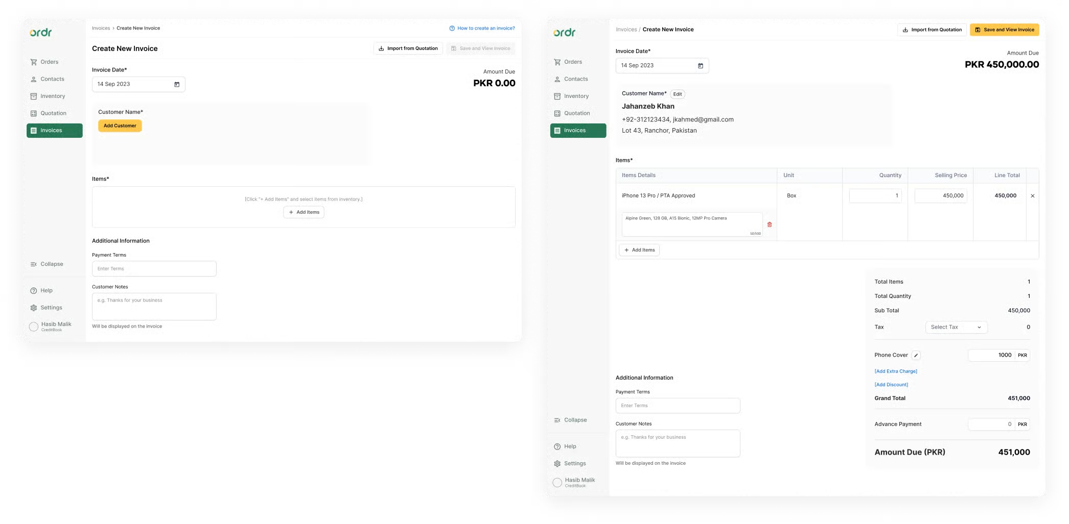
The layout and hierarchy were getting stable. I focused on interactions, specifically selecting a customer and item. Previously, a modal opened for each. I replaced this with a powerful search-and-select input field, retaining the modal only for multi-selecting invoice items. I also refined the visual decisions around input field states and interactions.
Final iteration
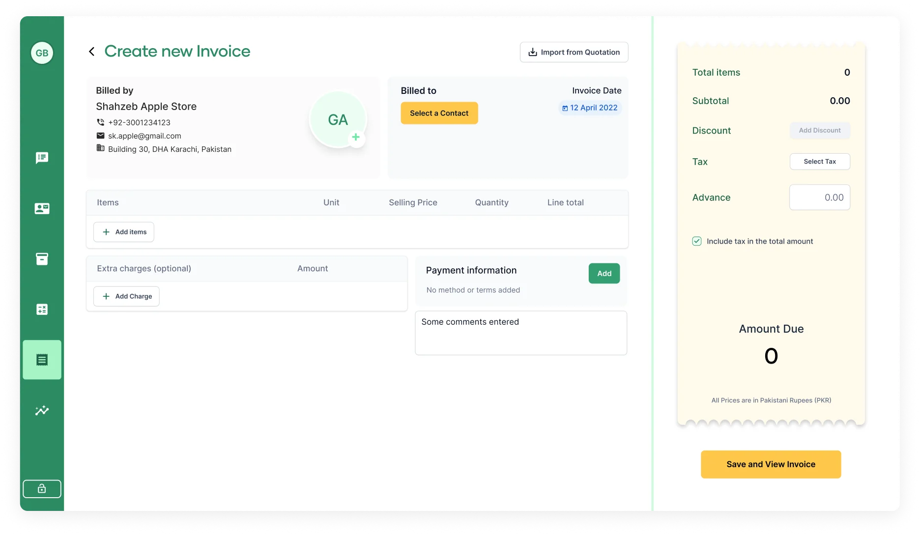
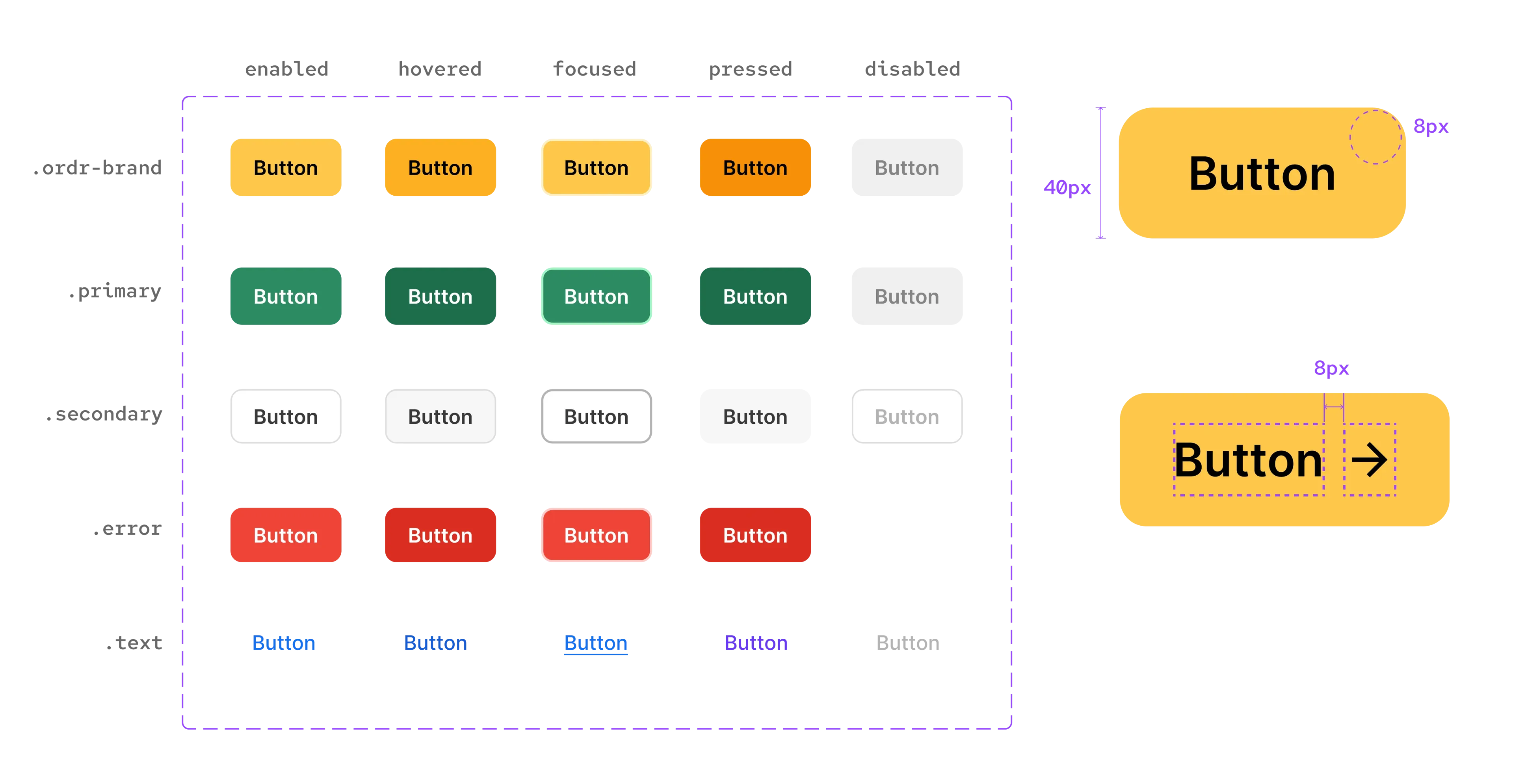
The fourth iteration showed positive results in usability studies, but users struggled to identify clickable fields. The gray background of the customer region made it read as disabled, and table cells lacked borders to signal interactivity. I addressed these design flaws by adding border strokes and making more deliberate use of gray for customer details.
Solution
A Faster and More Seamless Experience
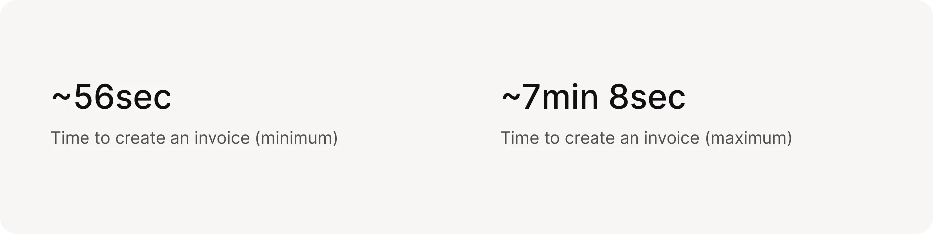
Ideally, the invoice creation process from start to finish should take no longer than a minute. Responsiveness was a big consideration throughout. Many users also generate invoices on the go using their mobile and tablet devices.
Results
A Resounding Success
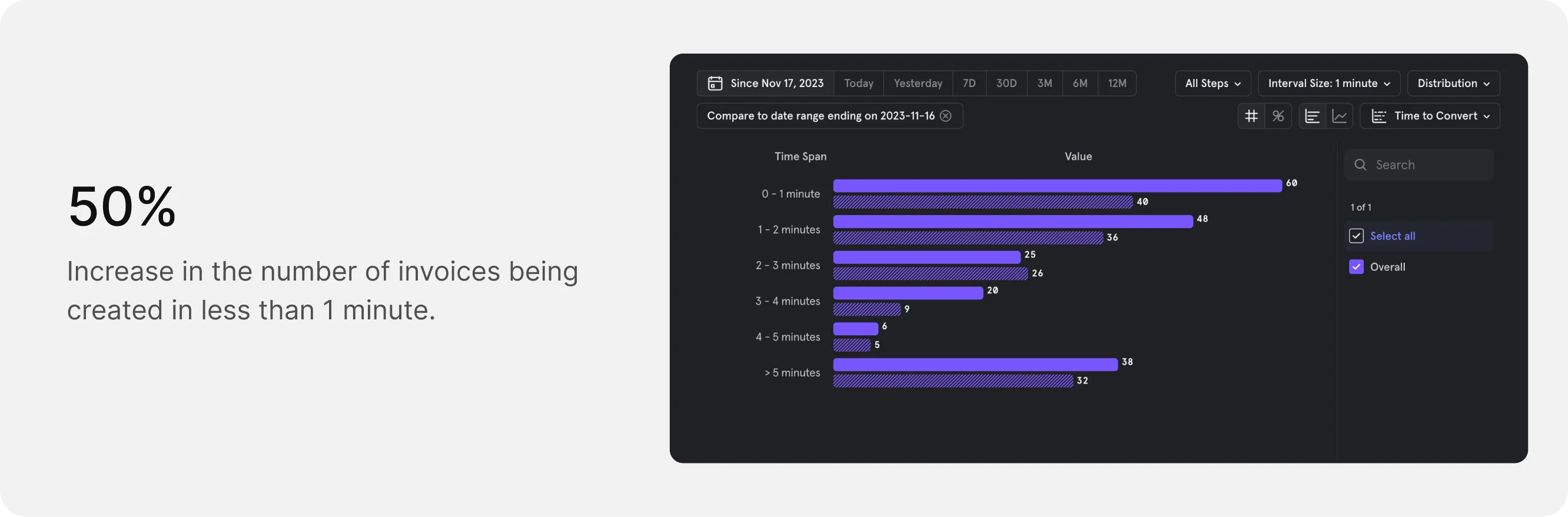
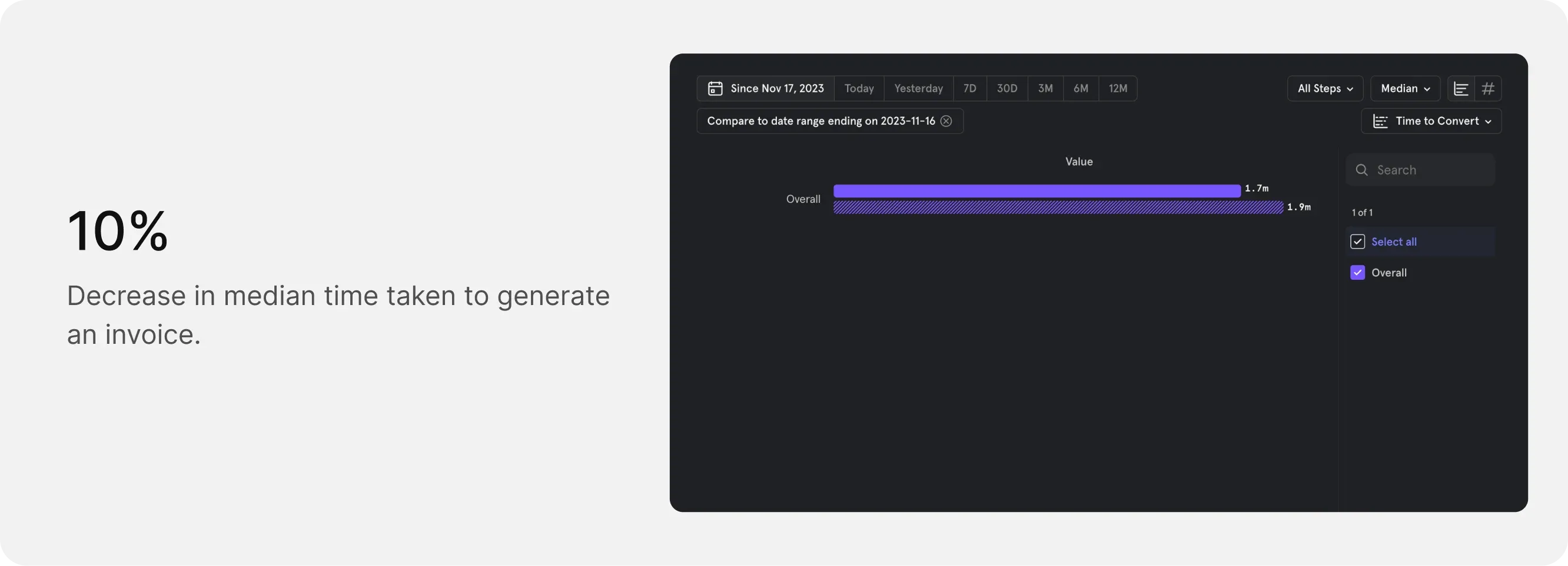
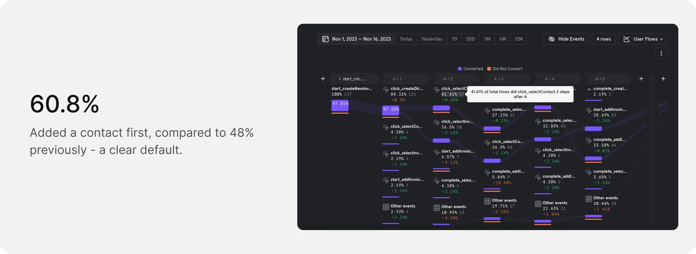
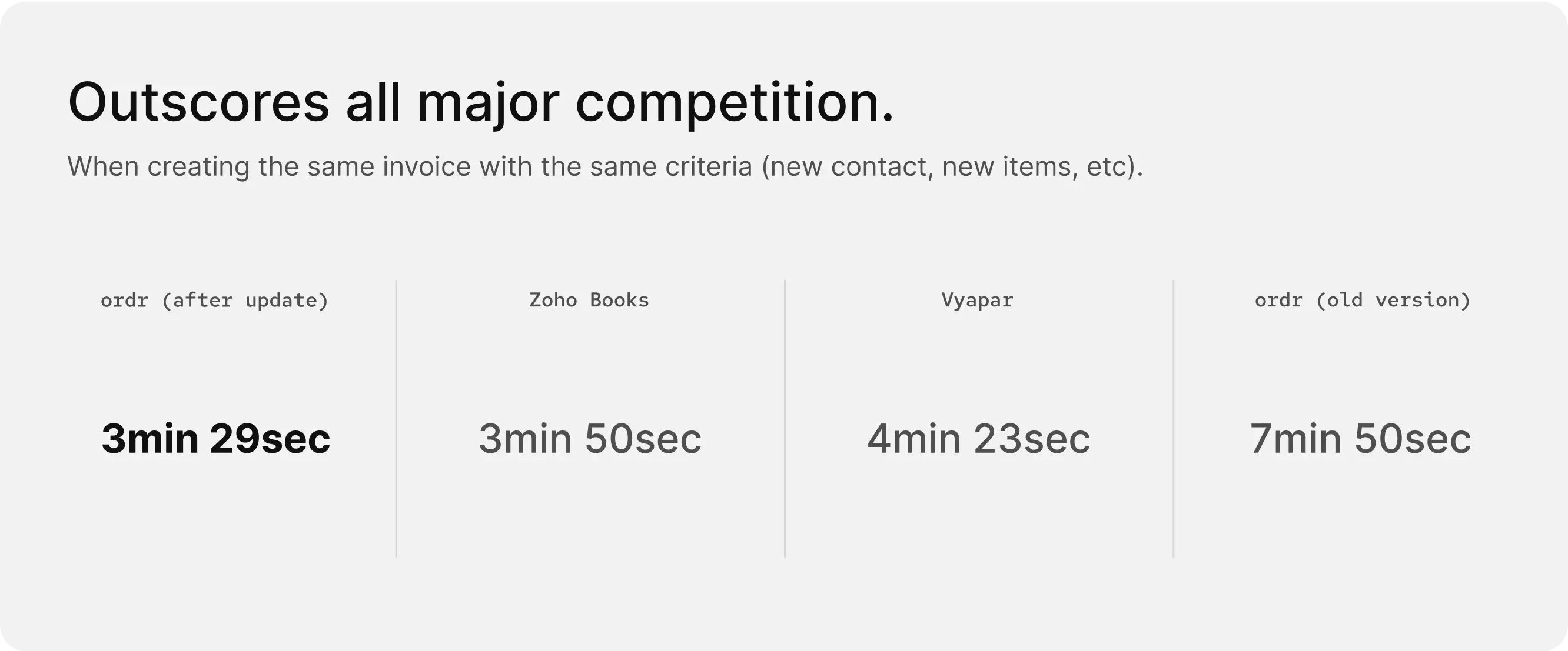
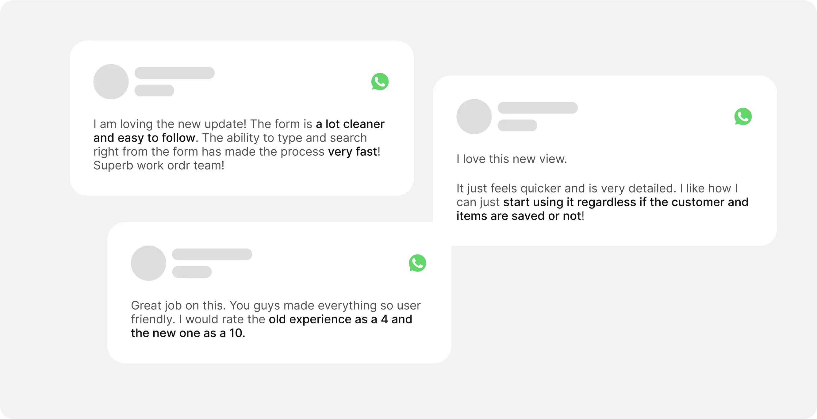
The redesigned invoicing module was met with overwhelmingly positive feedback from customers. Daily invoice generation rose by 120%, and the average time to create an invoice dropped by 50%, now around 3.5 minutes. The revamp not only resolved the performance issues but positioned Ordr's invoicing experience as one of the best on the market.
The attention to detail and intentional design didn't go unnoticed. The redesign was very well received by users and stakeholders alike.
increase in daily invoice generation
drop in time to create an invoice
Learnings
Sometimes Boring is Best
This project demonstrated how a data-driven approach, combined with user-centric design and thorough market research, can lead to significant improvements in both functionality and user satisfaction.
- 1. Examining constraints from various angles inspires fresh approaches to address other limitations.
- 2. To ensure sustainable progress, involve cross-functional stakeholders from the start. This allows you to effectively consider business viability, content strategy, and technical feasibility from the outset.
- 3. If an additional step results in a more seamless experience, it adds to simplicity rather than complexity.
Interested in working together? Get in touch.