Case Study

Harmony Web - A Design System

When CreditBook shifted from a B2C budgeting app to embedded financing for consumers, Financial Institutions (FIs), and banks - I led the creation of Synergy, a coherent, code-backed design system. I audited four live products, prioritized shared components, defined brand-to-product foundations, built a research-backed pattern library, synthesized page layouts, and ran a 2-phase handoff with engineering to ship a React implementation.
ROLE
- Lead designer and owner of the Design System.
- Defining Design System Architecture, Cross-functional Collaboration, and Design-to-Dev Workflow
TIMELINE & STATUS
3 Months, November 2022 to January 2023
Impact
Became more than a design system
Harmony Web became the backbone for how the team shipped the new Ordr product.

- It reduced the number of design-to-dev clarification messages during the MVP build by an estimated 40 percent.

- It let us design and implement new features with significantly fewer visual inconsistencies.

- It enabled the team to ship a complex web MVP in about one quarter, something that would not have been feasible without a shared design foundation.

- It accelerated onboarding for new designers and engineers, who could rely on clear documentation, reusable components, and predictable patterns.

- Most importantly, it allowed CreditBook to scale Ordr beyond the MVP stage without revisiting foundational design decisions.
Context
Why this project was needed?
When I joined CreditBook, the company had one public facing product, a ledger (khata) Android app used by small business owners. As we began developing a new product called Ordr, primarily web-based with plans for a mobile companion, we needed to move fast.

Because this was an unproven product bet, I had only two months to design the MVP. To move efficiently and ensure long-term scalability, I decided to build a web-focused design system, an evolution of our existing mobile system, Harmony.
Goals
The goal was clear
- Build a Figma-based component library mirroring how developers work in React. A design system is not just for designers but for all functions.

- Enable rapid, consistent design iteration.

- Ensure smooth, accurate implementation by developers within the same quarter.
Planning
An extension to the existing design system
Since the existing Harmony Design System for Android was already familiar to our users, we didn’t need a brand overhaul, just a natural extension for the web.

However, because multiple teams were still actively shipping mobile features, modifying the mobile DS would have disrupted ongoing work.

So, I created a separate but connected system: Harmony Web.

To structure it, I followed Brad Frost’s Atomic Design model, breaking the work down into:

1. Foundations such as colors, typography, spacing, icons, and layout.

2. Components such as buttons, inputs, badges, tables, and modals.

3. Patterns and Templates including layout grids, navigation frameworks, and page compositions.
Foundations
Setting the fundamentals
I began by adapting the visual DNA of Harmony Mobile for web.

Colors
Expanded the palette with new accent variants while maintaining brand consistency. The system was WCAG 2.1 compliant, with defined contrast ratios (AA and AAA) visible for every tone.
Typography
Paired Gilmer for display with Inter for body text. Each style included documented font size, line height, and tracking values.
Spacing
Created a 16px base grid scaled with REM units for responsiveness, with a fully documented scale from 4px to 256px.
Layout
Defined a responsive 12-column grid system for desktop, tablet, and mobile. Each region of the app had clear rules, including top navigation, side navigation, and content areas.
Components
Building blocks of the UI
Once the foundations were ready, I began building core and advanced components, all structured with Auto Layout and variant logic.

Buttons
Nudge, primary, secondary, and link tiers with complete states including hover, disabled, error, and dropdown variations.
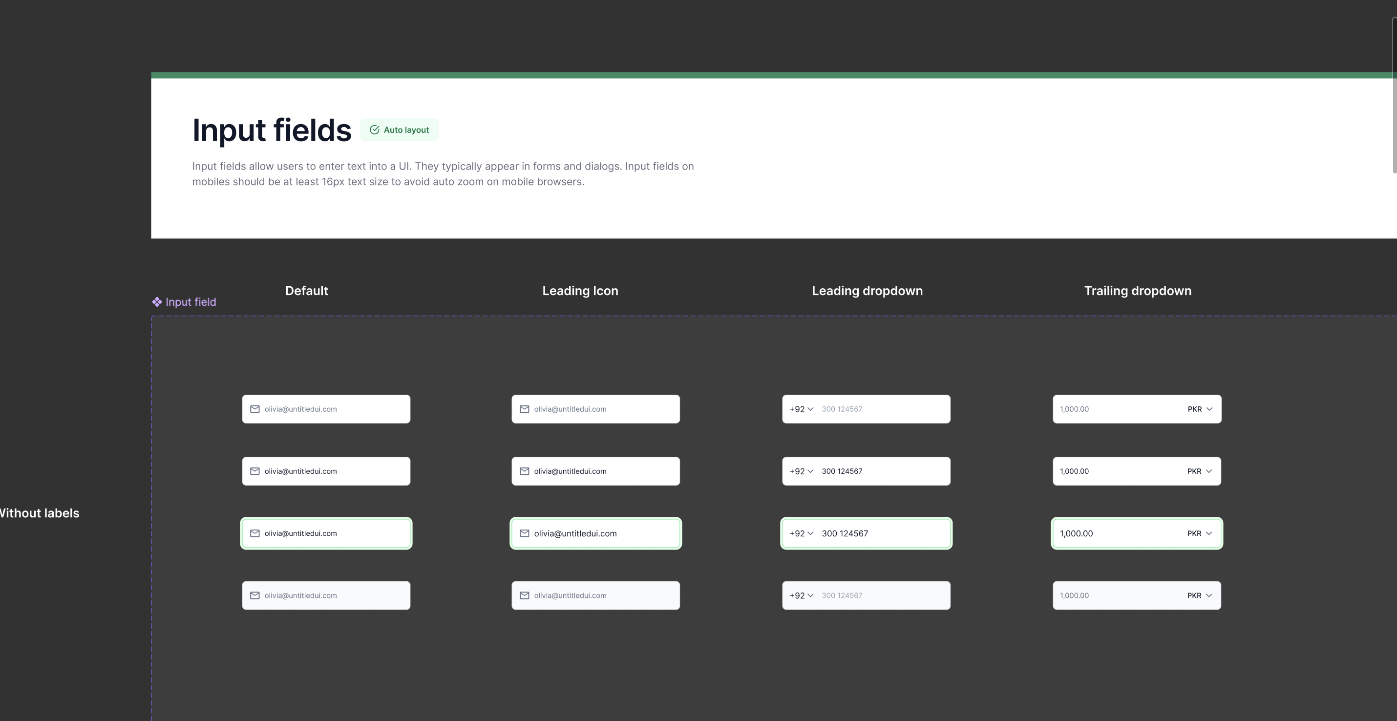
Inputs
Highly modular fields supporting labels, icons, dropdowns, and country codes for complex data entry scenarios.
Badges
Semantic and expressive, aligned with brand colors to represent status and context. There were two sets of badges - simple ones and the other that provide more context e.g. New Feature.
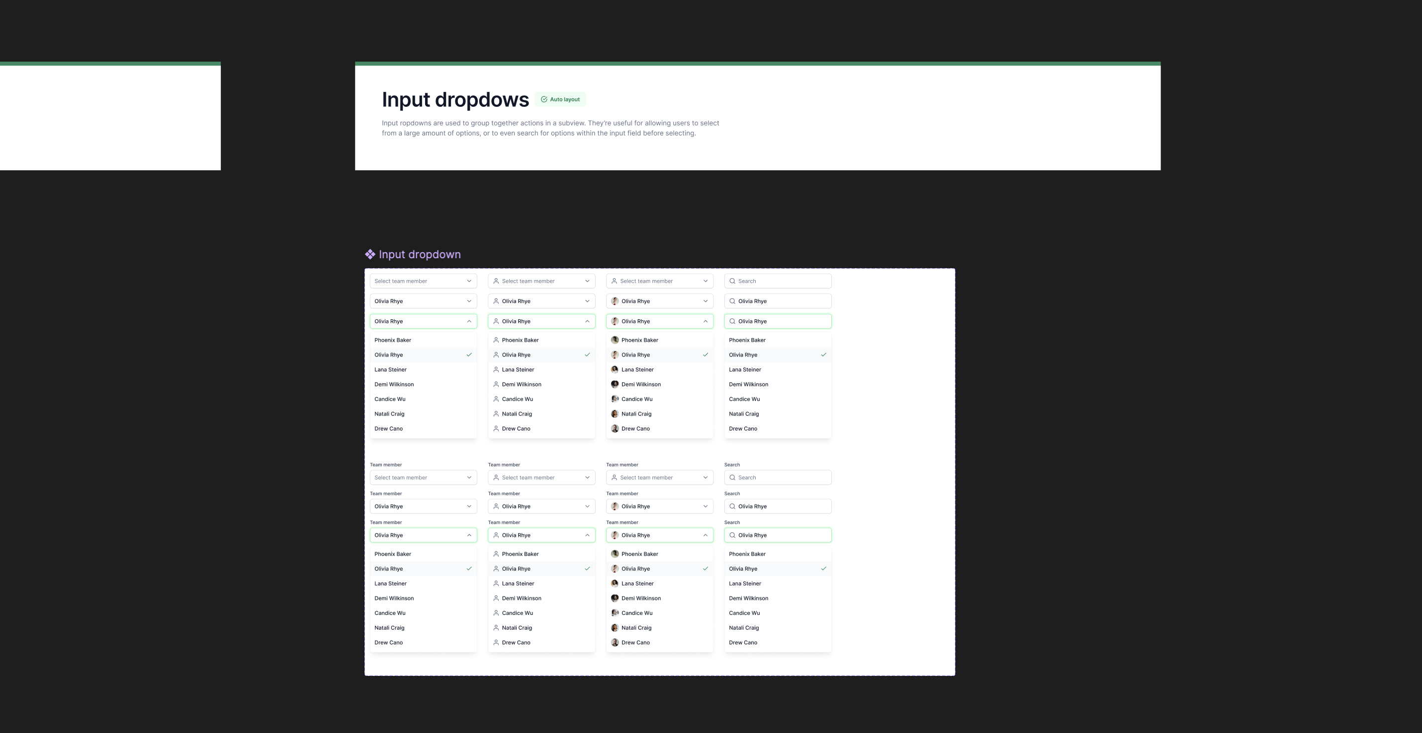
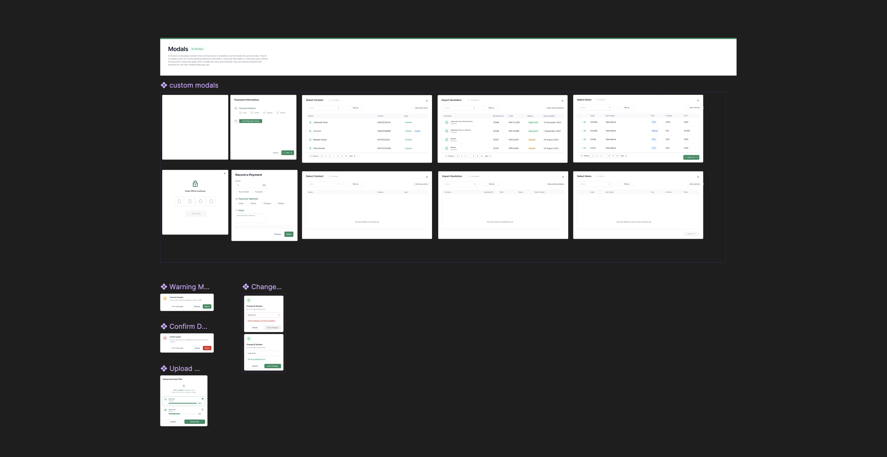
Dropdowns and Modals
Built for workflows like selecting contacts, recording payments, and importing quotations. A core requirment for these components was their flexibility.
Tables
The most complex component to prepare and the one that required the most context and ongoing optimizations. I had to create and manage different instances for the table as the product grew.
Collaboration and Delivery
Turning it into reality
I involved engineers early in the process and shared access to the design system as soon as the initial foundations were ready.

While I used Harmony Web to design the Ordr MVP, developers restyled their React component kit in parallel using the same logic and tokens.

This allowed both teams to move faster and maintain alignment without additional sync overhead.

By the time I handed off the product flows, the coded components were already in place. The project ended up launching in April instead of March, but it still shipped within the quarter on a solid and scalable foundation.
Reflection
Turning it into reality
Building Harmony Web taught me that design systems succeed when they are practical, flexible, and built with cross-functional partnership in mind. It reinforced the value of:

- Treating design systems as evolving tools.
- Designing with developer constraints rather than against them.
- Structuring Figma components to reflect the actual code architecture.

This project fundamentally leveled up how I think about systems, velocity, and long-term product health.

Harmony Web is still one of the most efficient systems I have built, and it influenced how future web products at CreditBook were designed and implemented.
See Next Project
Invoice Creator
Links:
© 2025 Shahzeb Kazmi. All Rights Reserved.