Synergy: the new CreditBook design system
When CreditBook shifted from B2C budgeting to embedded financing, I led the creation of Synergy: a coherent, code-backed design system. I audited four live products, defined foundations, built a pattern library, and ran a 2-phase handoff with engineering.
- Company
- CreditBook
- Industry
- FinTech / Embedded finance
- Role
- Lead Designer (Design System)
- Timeline
- 2 months (handoff Aug 2024)
- Key areas
- Audit, Tokens, Pattern library, Handoff
Goal
CreditBook was rebranding from a budgeting app to embedded finance. The audience moved to operators at banks and FIs. The UI needed to feel refined, professional, and trustworthy. I framed Synergy as both product (tokens, components, docs) and process (how teams work around those assets).
Challenge
Four products in active use (Credr, FI Book, Partner Book, Embedded Financing), each with legacy choices. Inconsistent padding, states, labels, color semantics, and icon choices. I ran a visual inventory, labeled everything by function and usage, and logged inconsistencies to prioritize.
Outcome
Faster design-to-dev delivery, fewer UI bugs, and high component reuse across all four products. Designers reported hours saved per feature. New designers reached productivity in about 1 week instead of 3–4.
duplicate patterns removed
months to handoff
01
Audit. Get the truth on the table
I captured a visual inventory of every component across the four products, labeled by function, variants, and usage frequency. I logged inconsistencies (padding, states, labels, color semantics, icons) to build a single source of truth for what had actually shipped.
Key steps
- Screenshots and catalog of all in-use components
- Label by function, variants, usage frequency
- Document gaps and inconsistencies for prioritization
02
Foundations. Brand to product tokens
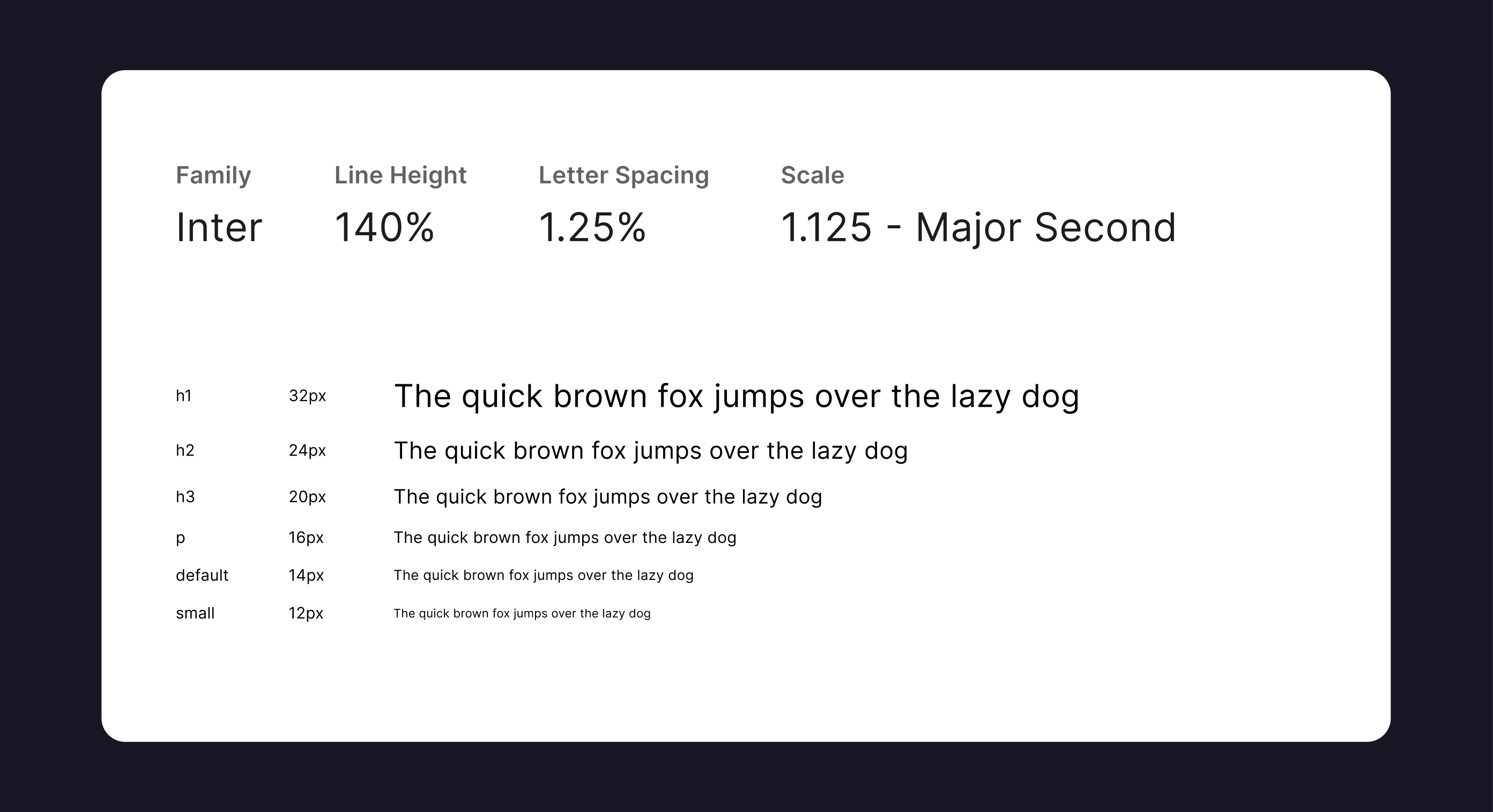
I used an atomic model. The brand existed; I needed product-grade decisions. Typography: Inter, 14px default (backed by a competitive audit of enterprise dashboards). Color: “You see purple, you can click.” Actionable = purple; non-actionable = grayscale. Spacing: 4px grid. Icons: Phosphor, agreed with engineering for React and consistency. All tokens with WCAG AA and examples.
Key decisions
- 14px base for density and readability in pro tools
- Purple-for-action rule to clarify affordances
- 4px grid; restrained elevation and radius
03
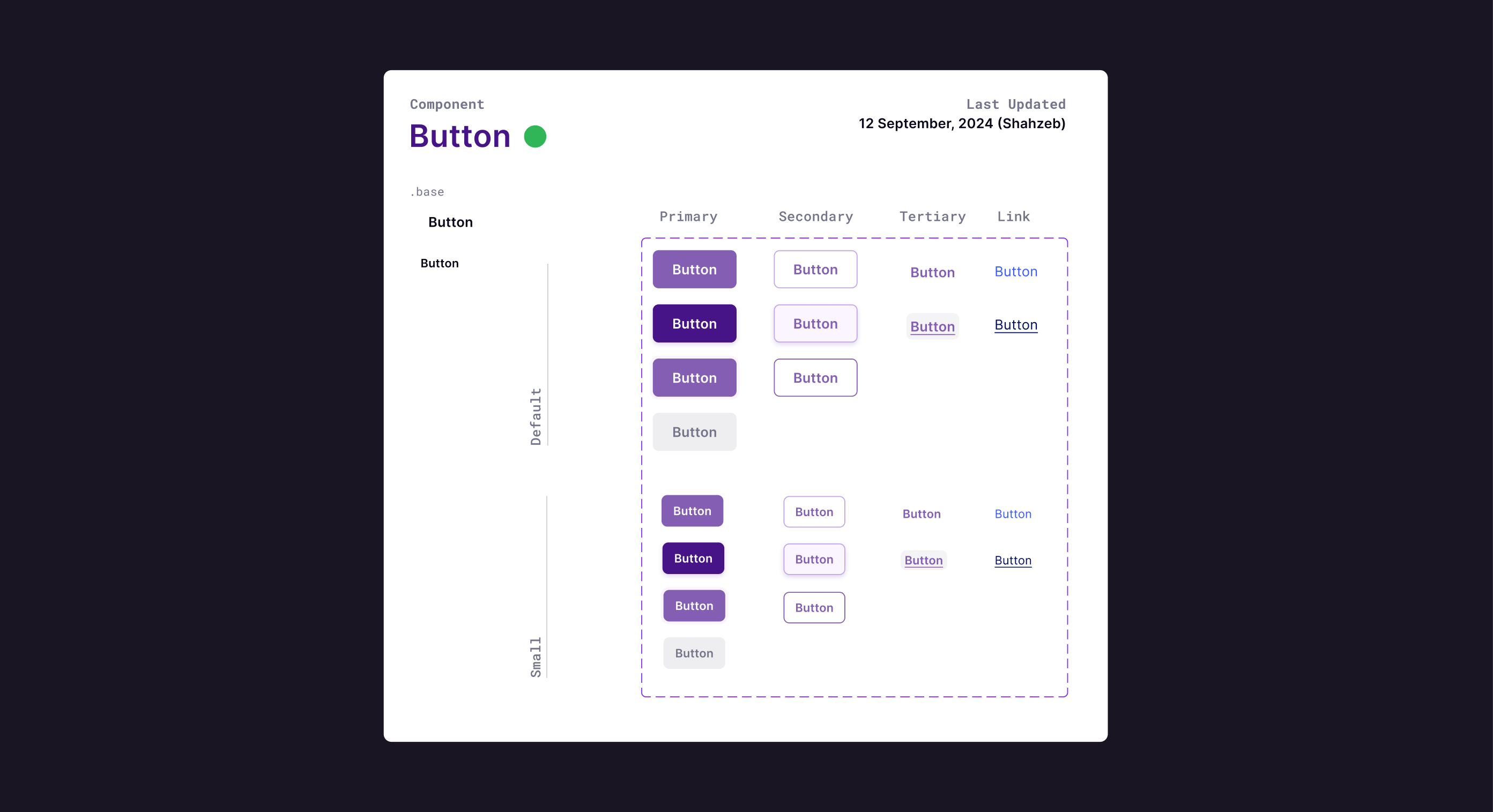
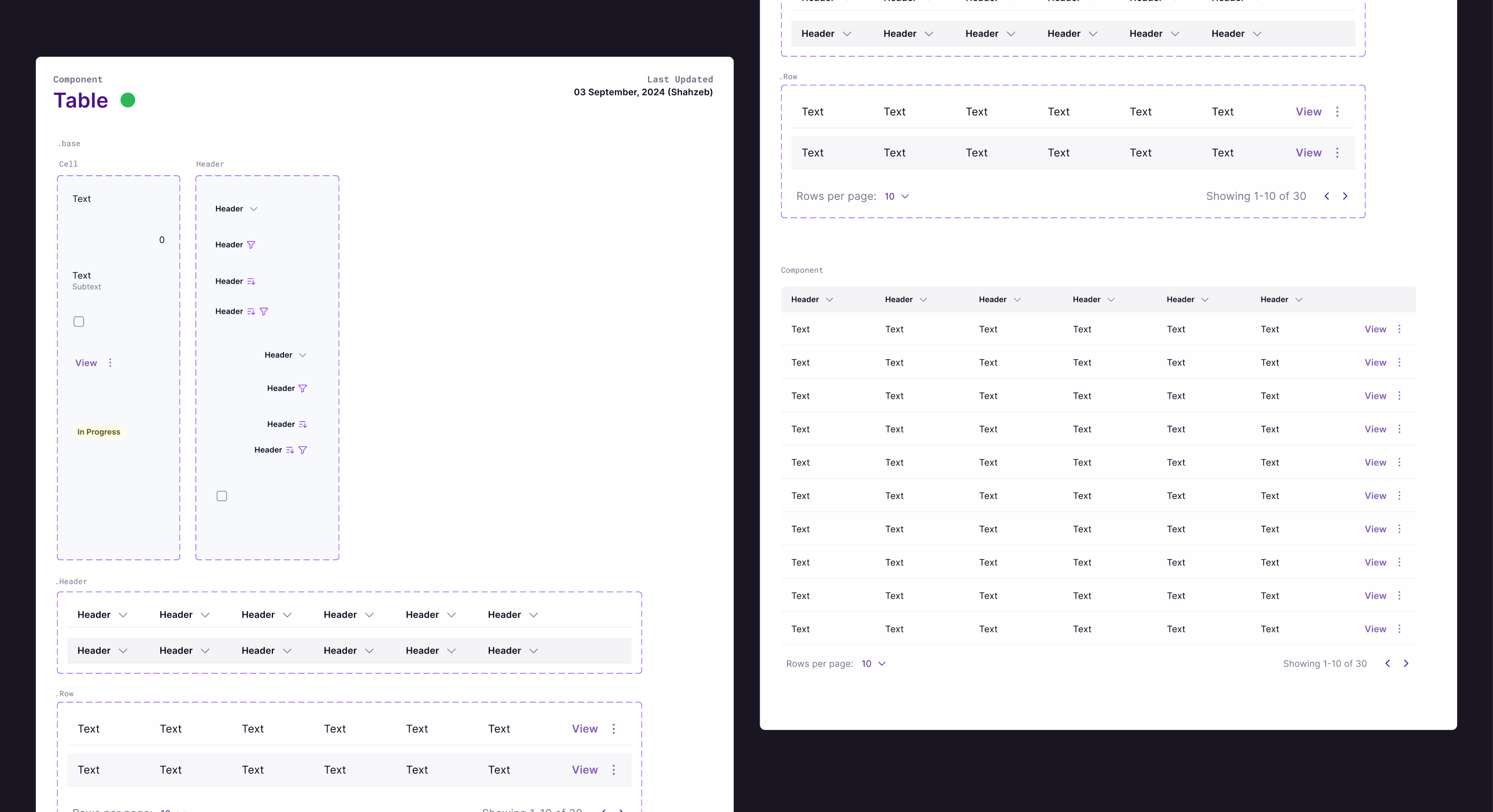
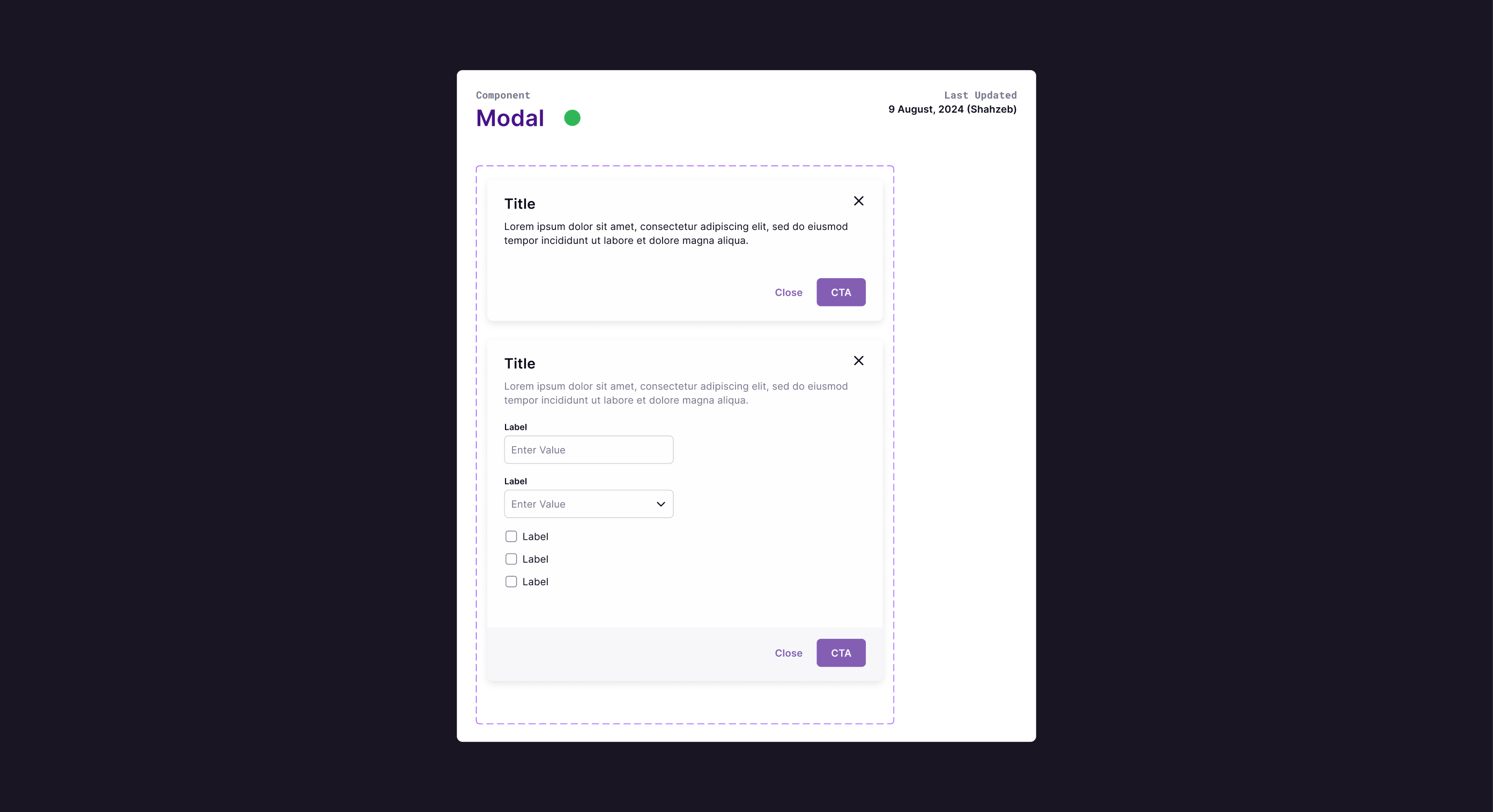
Pattern library. Research-backed components
Not just a Figma sticker sheet. Each component had best practices, states (default, hover, focus, disabled, error), accessibility (hit areas, focus, labels, contrast), and rationale so PMs and engineers had the “why.” Inputs (fields, buttons, dropdowns, checkbox/radio), display (tags, modals, tables, tabs, toasts, banners), and decision trees (e.g. when to use snackbar vs modal vs banner).
Key improvements
- Full states and accessibility specs per component
- Do/don't and rationale to reduce future debates
- Decision trees for interruptive vs ambient messaging
04
Layout and handoff. How the parts come together
I chose predominantly flat pages with clear information and contained cards only where needed (e.g. right-rail summary). Standard scaffolding: global header, left nav, page header, content zones, optional right rail. Handoff in two phases: foundations + inputs first; then display components and layout templates. Engineering built a React component library with versioning, change logs, and a contribution model (propose → review → accept → document → release).
Key improvements
- Flat layout for focus and data density
- 2-phase handoff so engineering could ship incrementally
- Contribution model so the system could evolve safely
Reflection
Synergy was as much process as product. Every decision was grounded in usage frequency, research, and feasibility. In a finance context, trust and clarity aren't optional. Building the system that way helped design, engineering, and PM move faster with more confidence. A few things I'm glad I fought for: 14px validated by competitive scan, the purple-for-click rule, Phosphor icons, and documented rationale everywhere so future debates had a clear reference.
Interested in working together? Get in touch.