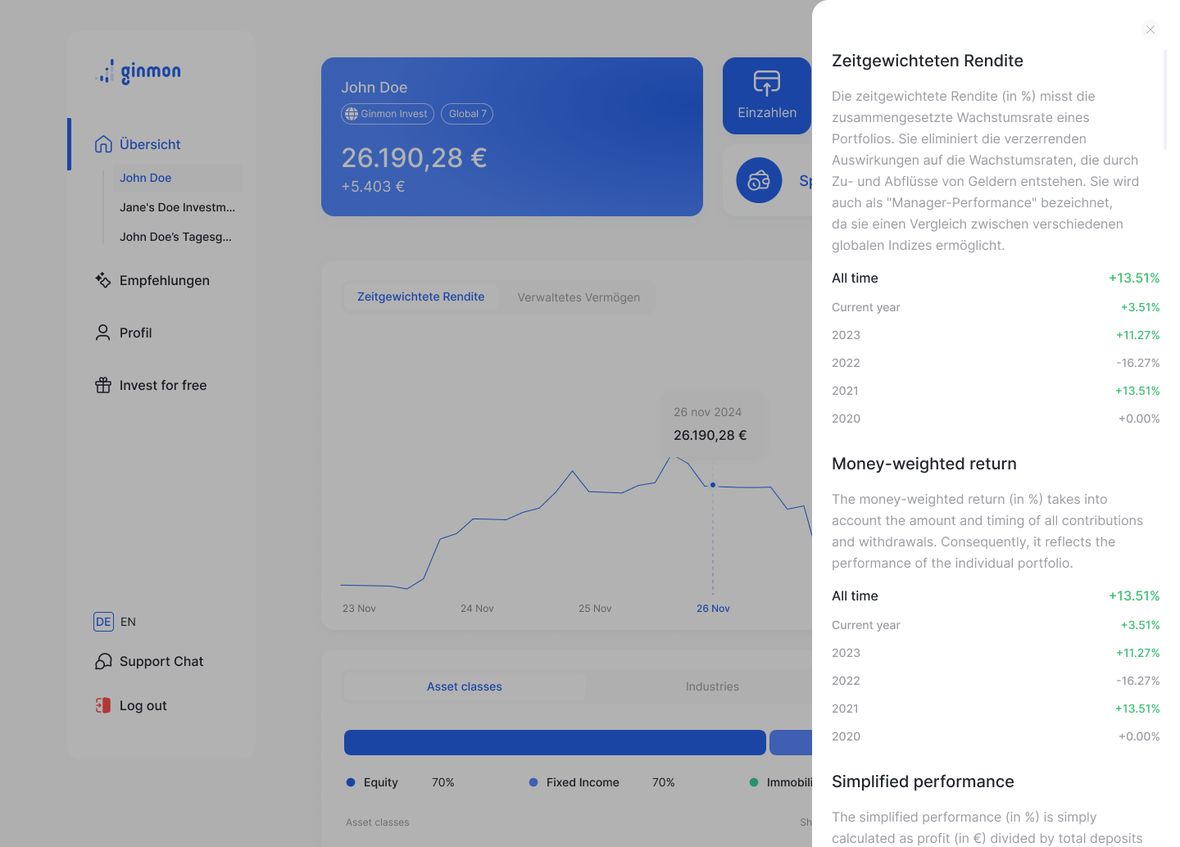
Overlays: a decision system for pop-ups, sheets, and panels
One rule. One set of constrained components. Every overlay in the product.
At Ginmon, overlays had drifted out of control. The same action could be a pop-up in one place and a bottom sheet in another. As part of a wider design system refresh, I owned the overlay layer end to end: from defining when each surface is used, through to building the components and shipping them with engineering.
- Company
- Ginmon
- Industry
- FinTech / Wealth management
- Role
- Product Designer
- Scope
- Overlay layer, within a wider system refresh
- Key areas
- Research, Framework, Components, Accessibility, Handoff
Goal
Replace ad hoc overlay decisions with one clear, adoptable system, and rebuild the components so they cannot drift. Make picking the right surface obvious for designers and engineers on both mobile and web.
Challenge
Two problems at once. No usage criteria, so the same intent appeared as a modal, a sheet, or a panel depending on who built it. And no component discipline, so every instance was rebuilt slightly differently.
Outcome
One decision rule and one set of tokenized, constrained components now cover every overlay in the product. The system is documented, enforced by the components themselves, and accurate enough to drive AI prototyping.
flows specced and shipped
surfaces unified under one rule
decision question
01
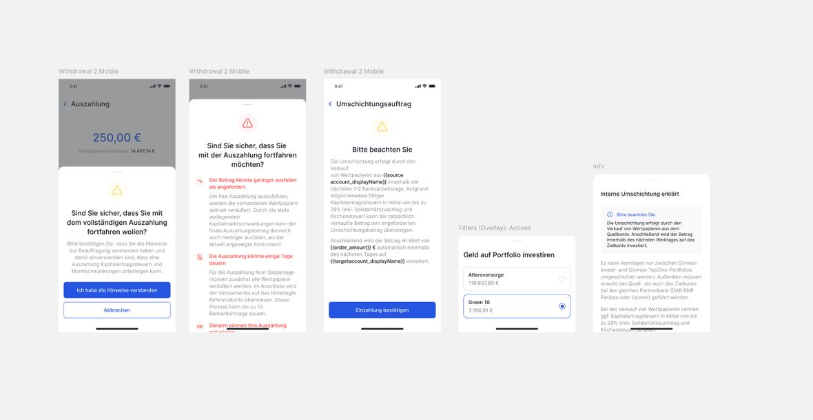
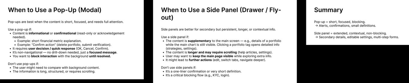
Problem. Same app, five different overlays.
Overlays had drifted. The same kind of action could appear as a pop-up, a bottom sheet, or a side panel, decided case by case by whoever happened to build the screen. Underneath the inconsistency were two separate problems.
No usage criteria. There was no rule for when to use each surface. A terminal success message was a draggable bottom sheet on mobile but a centered modal on web. A strategy change showed up on desktop as a small pop-up stranded in the middle of a wide screen. A multi-step MFA flow was crammed into a modal, a surface outgrown by its own complexity.
No component discipline. Even within a single surface type there were no shared patterns or dimensional constraints, so instances drifted in size and anatomy, and side panels shipped with contrast problems. The result felt inconsistent to users and made engineers rebuild the same thing repeatedly.

02
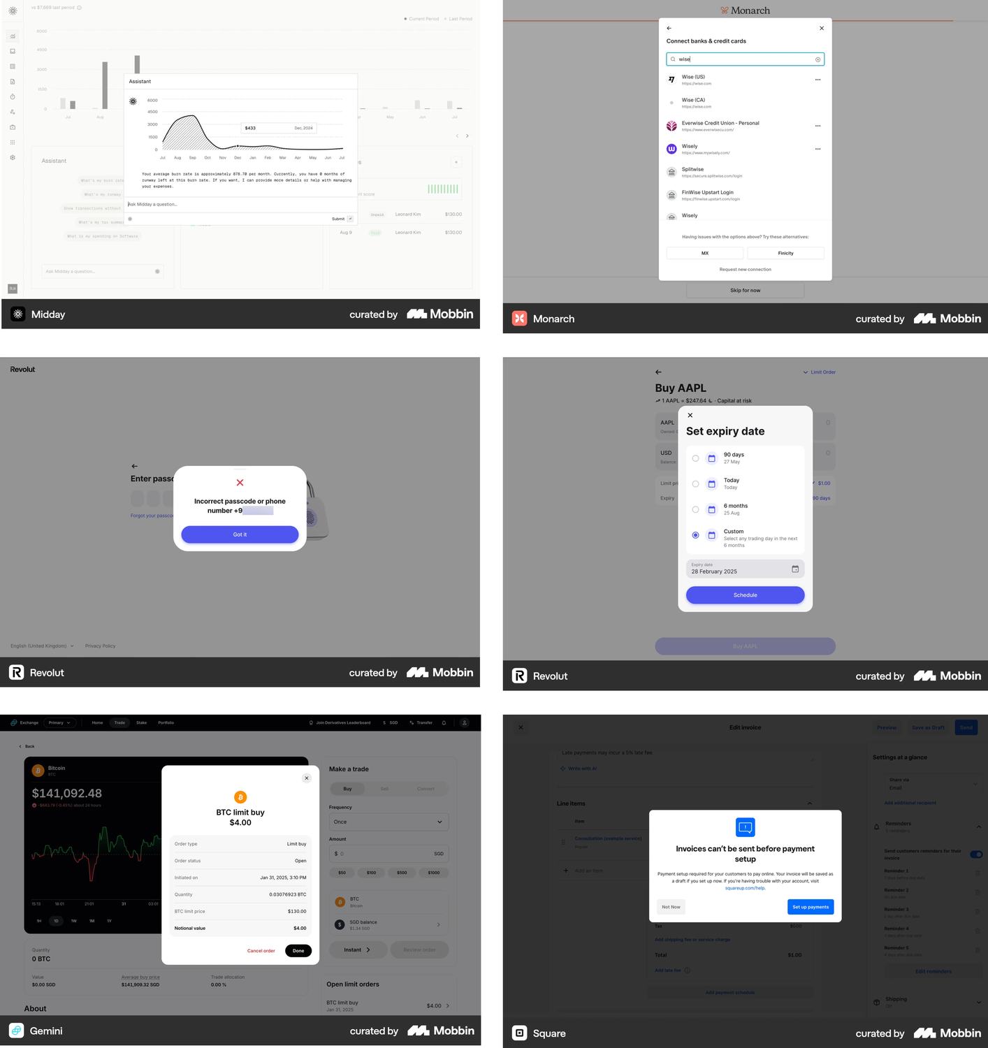
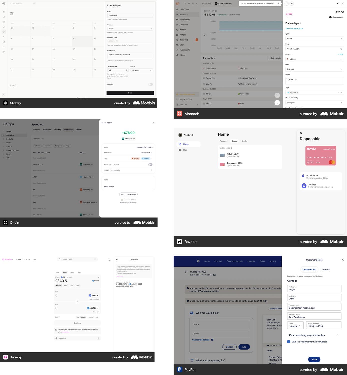
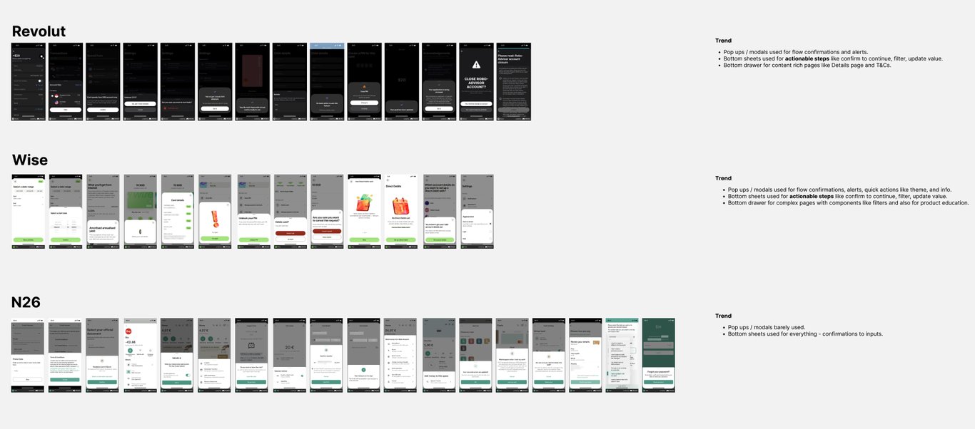
Research. Borrow from what already works.
I treated this as a research problem rather than personal taste. I started wide, studying how mature fintech and adjacent products use overlays, then narrowed to our direct competitors — Revolut, Wise, and N26 — and pulled apart how each one decides between a modal, a sheet, and a panel.
The convergence was clear: modals for confirmations and alerts, bottom sheets for actionable steps, drawers for content-rich pages. Where they disagreed mattered just as much. N26 barely used modals and pushed almost everything into sheets, which told me the split is a choice with tradeoffs, not a universal law. I distilled what I found into usage criteria, written as a decision tool with both when to use each surface and when not to.
Key decisions
- Benchmark real shipped products, not concepts
- Narrow from adjacent products to direct competitors
- Write the anti-patterns, not just the patterns
03
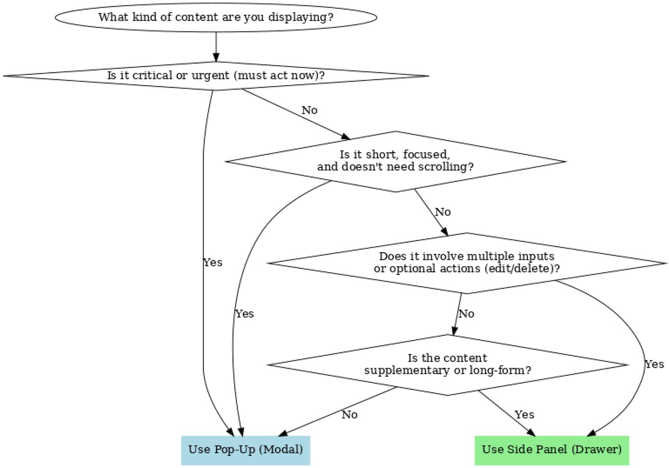
Framework. From a flowchart to one question.
My first version was a branching flowchart: content type, critical or urgent, short and scroll-free, multiple inputs, supplementary or long-form, down to modal or side panel. On paper it was complete. Every case had a path.
I took it to a working session with PMs, engineers, and the CTO. The feedback was direct: too complex and too abstract, not something a busy team would walk through every time. They asked for something simpler.
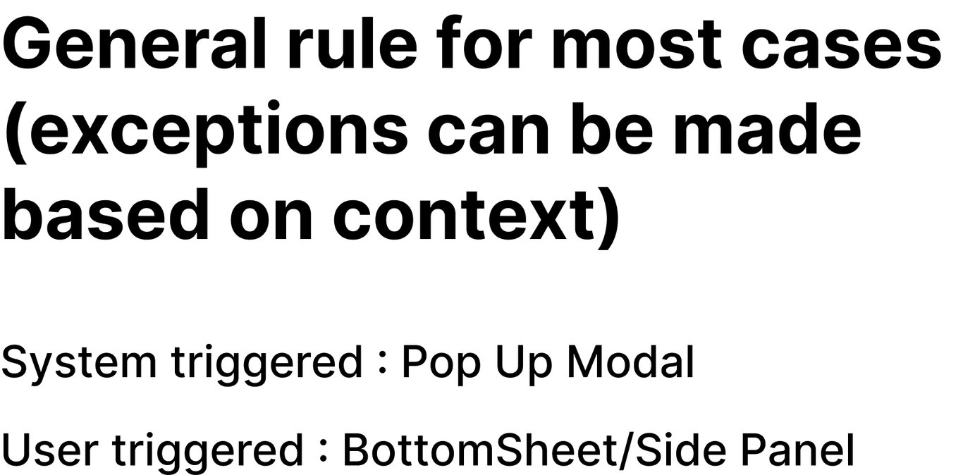
That was the turning point. A decision tool only earns its keep if people reach for it. So I asked what the flowchart was really testing, and almost every case came down to one thing: who triggered the overlay. If the system raised it, it interrupts, so it is a pop-up modal. If the user opened it, it should preserve their flow, so it is a bottom sheet on mobile and a side panel on web. One question, answerable in a second, framed as a strong default with room for documented exceptions.
Key decisions
- One origin question instead of five branches
- A strong default, with exceptions allowed by context
- The rule plus a four-surface manual, accepted as one package
System triggered
Pop-up modal
User triggered
Bottom sheet / side panel
04
Audit. Every flow, and the ones that broke the rule.
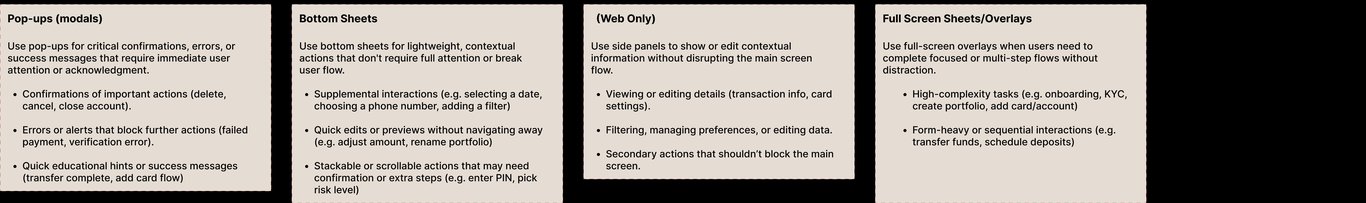
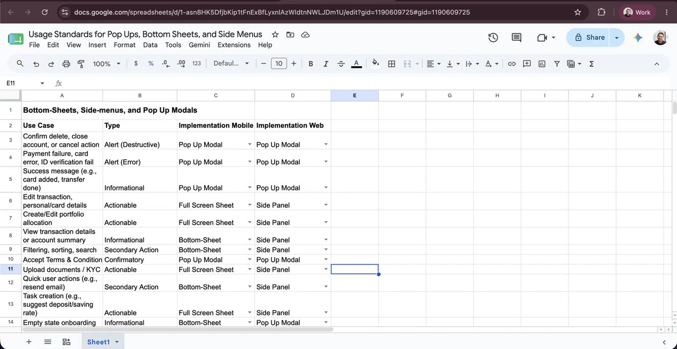
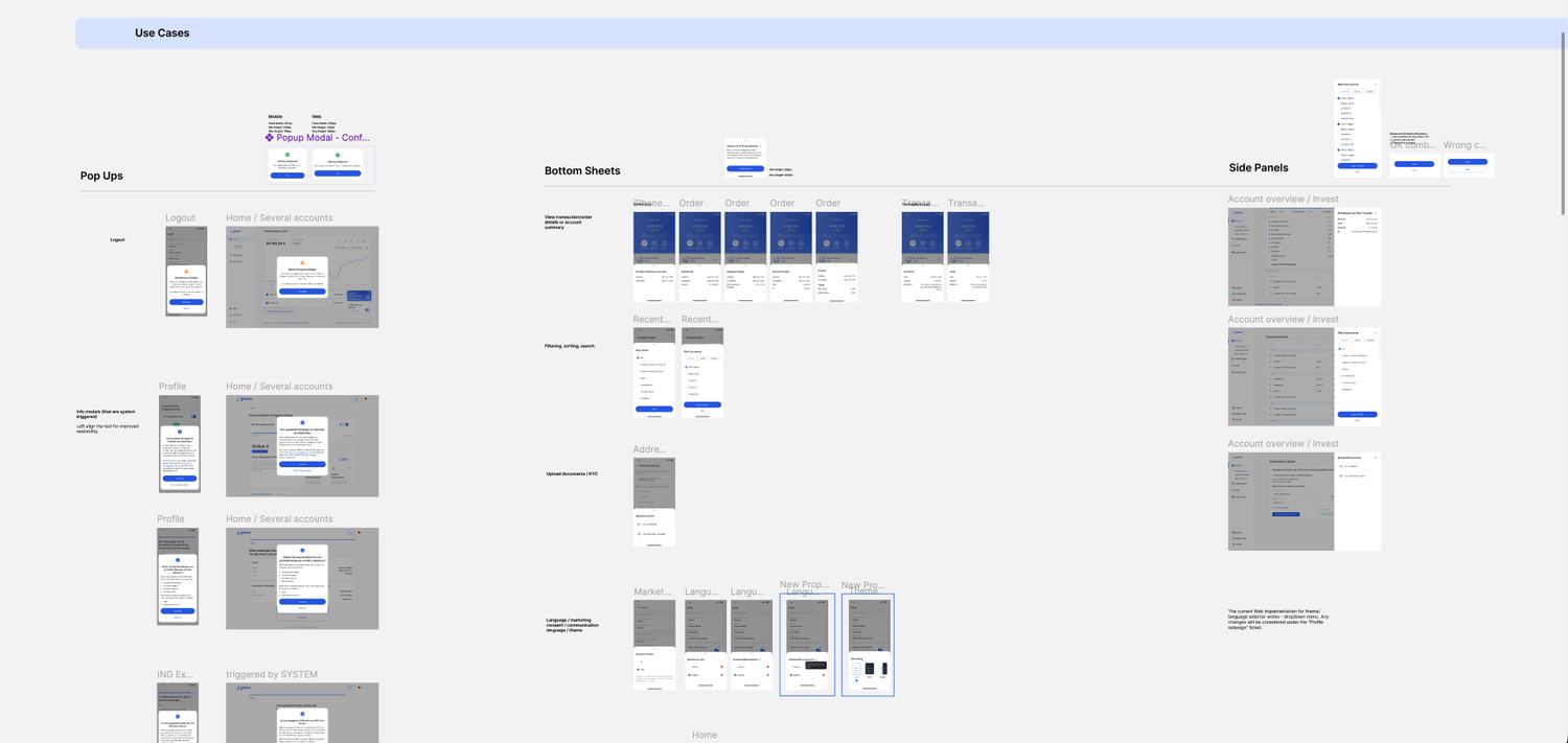
With the framework accepted, I went through the app flow by flow and catalogued every overlay: the use case, its type, and the right implementation on mobile and on web. This was application, not discovery. I already knew it was inconsistent. The audit produced the spec engineering would build from, and stress-tested the rule against reality.
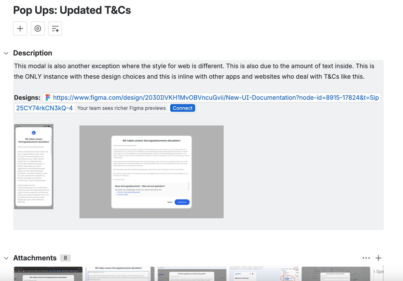
It mostly held. Where it did not, I documented the exception instead of forcing it. Terms and conditions is text-heavy, which points to a panel, but it is system-triggered and the industry standard is a modal, so I kept it a modal on both platforms and let only its dimensions flex. Regulatory information modals carry long body copy, so I left-aligned the text and scoped that as a controlled sub-rule. Each outlier was noted and resolved on its own terms.
Key decisions
- Audit as application and stress-test, not discovery
- Terms and conditions: keep the surface, flex only the size
- Exceptions documented with rationale, never silent
05
Components. One configurable component, not fifty.
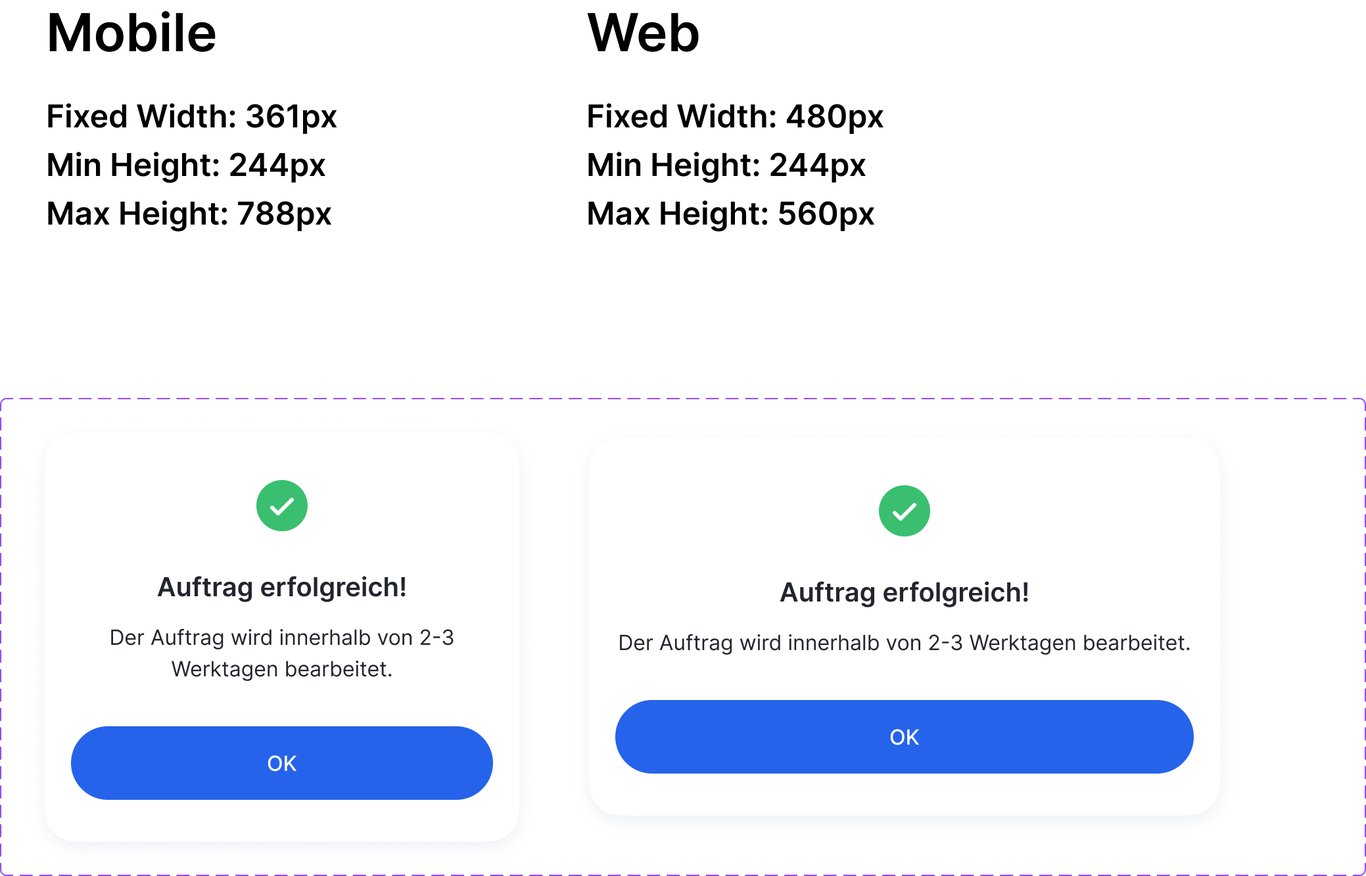
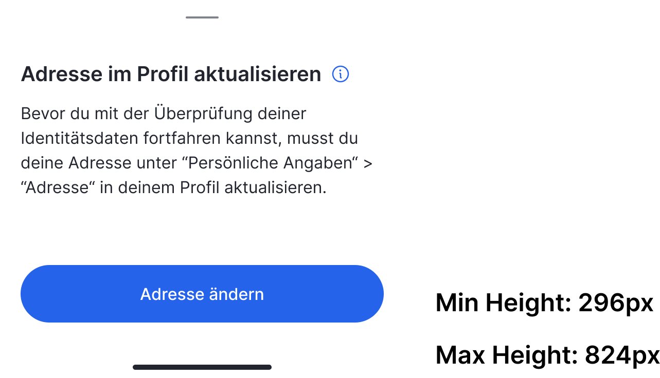
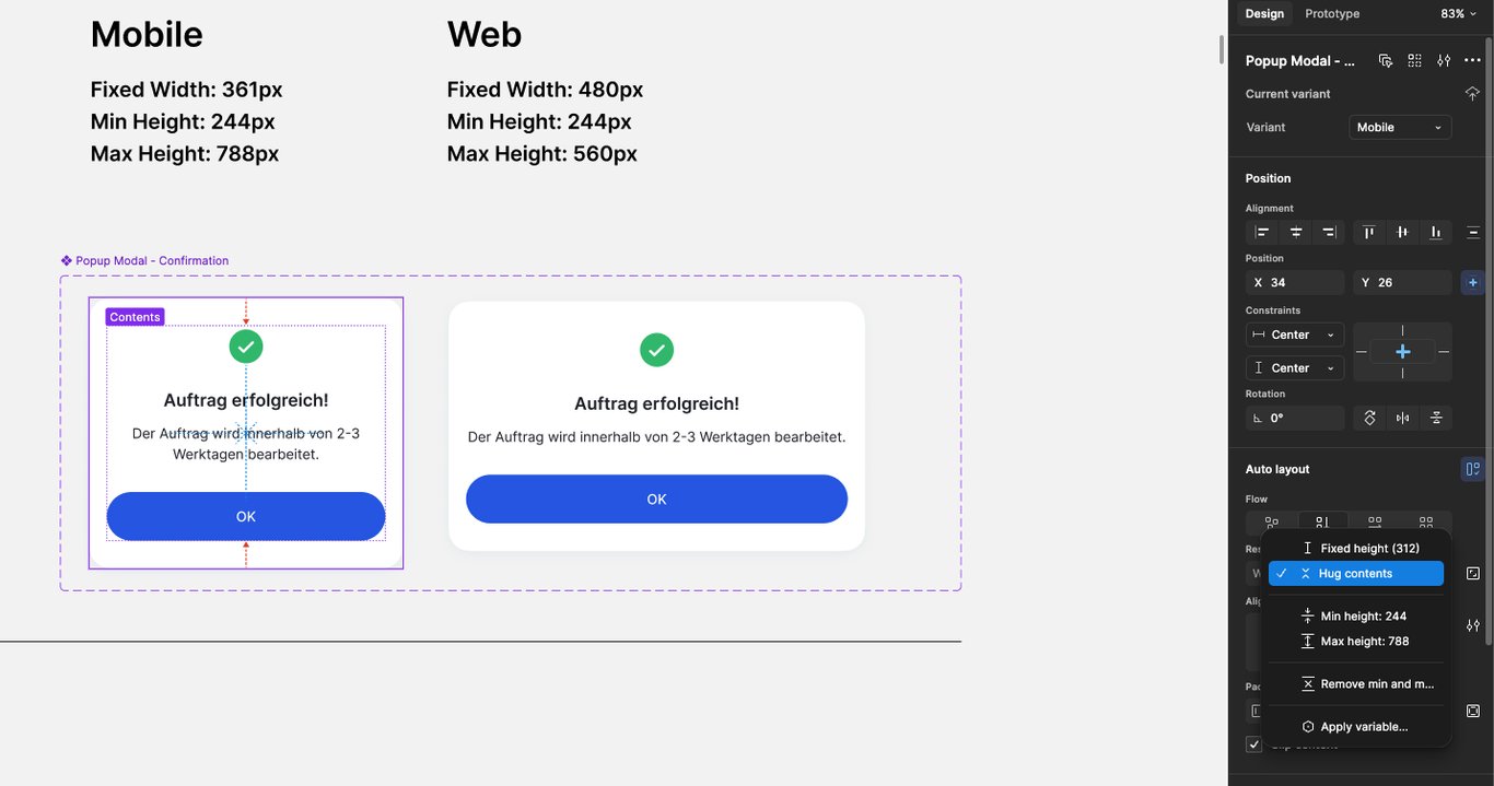
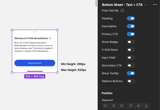
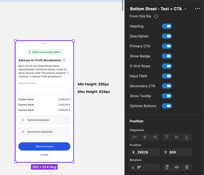
The framework decided which surface. The other half of the original problem was how the surfaces were built. I gave each a hard set of dimensional rules, set per platform for a reason: the success modal is 361px wide on mobile and 480px on web, sharing a 244px minimum height, but capped lower on web at 560px because a desktop viewport is wider than it is tall. The sheets work as a range, a minimum and a maximum height that flex to the content.
These constraints are baked into the component, not written on a spec sheet. The frame hugs its content but is locked to its min and max, with mobile and web as variants of one component, so the rule cannot be ignored. I built the surfaces to be configurable rather than duplicated: one bottom sheet driven by properties that expands from a lightweight notice to an input-heavy sheet.
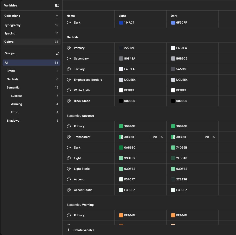
Consistency and theming I did not have to re-solve here. Earlier in the refresh I had built the tokenized foundations, so the overlays inherited them, themeable and dark-and-light aware by default. That is the return on a token system: you build the discipline once, and everything after it inherits it.
Key decisions
- Min and max heights enforced in the component, not documented
- One props-driven component instead of many one-offs
- Inherited tokens, so consistency came from the foundation
06
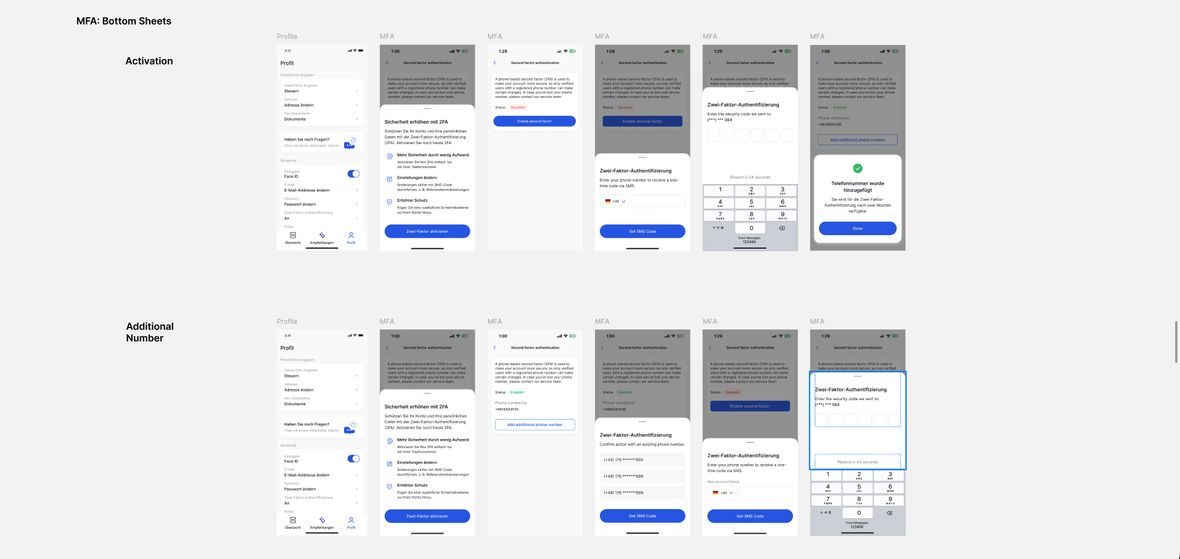
In product. Every case, mobile and web.
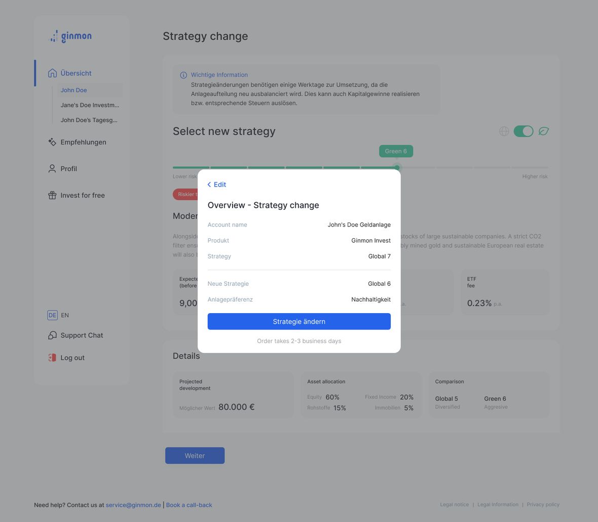
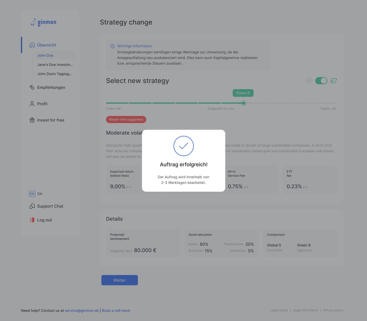
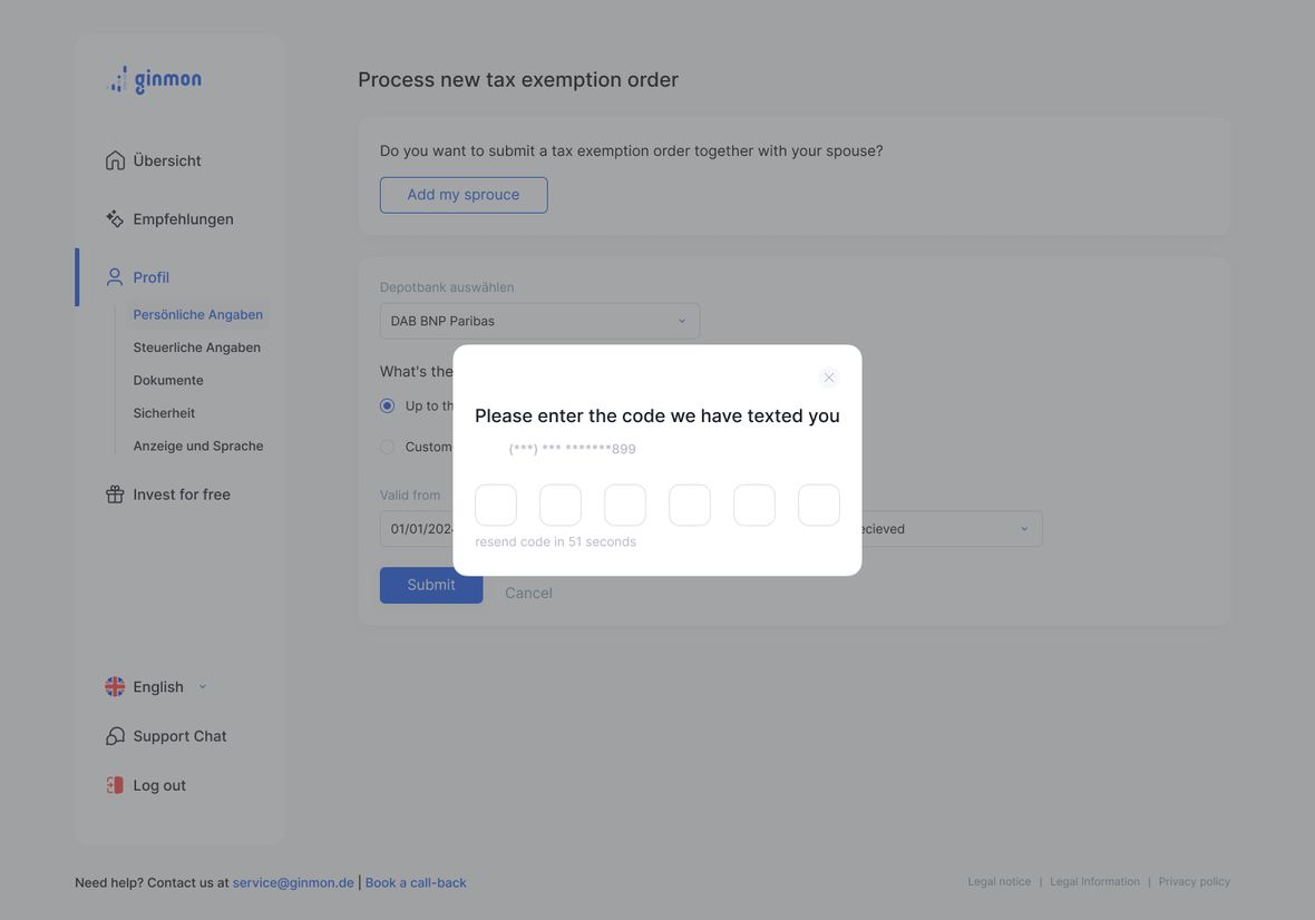
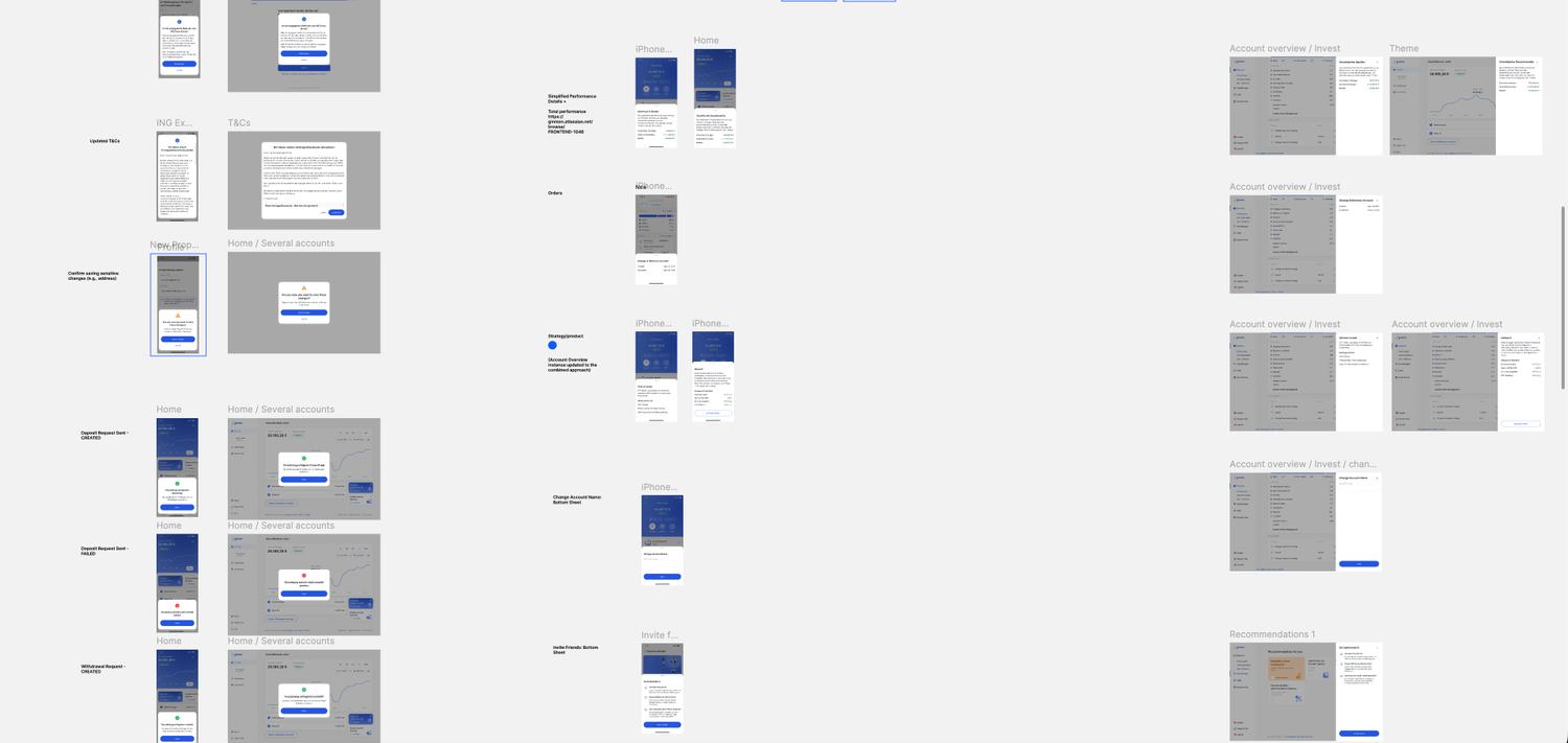
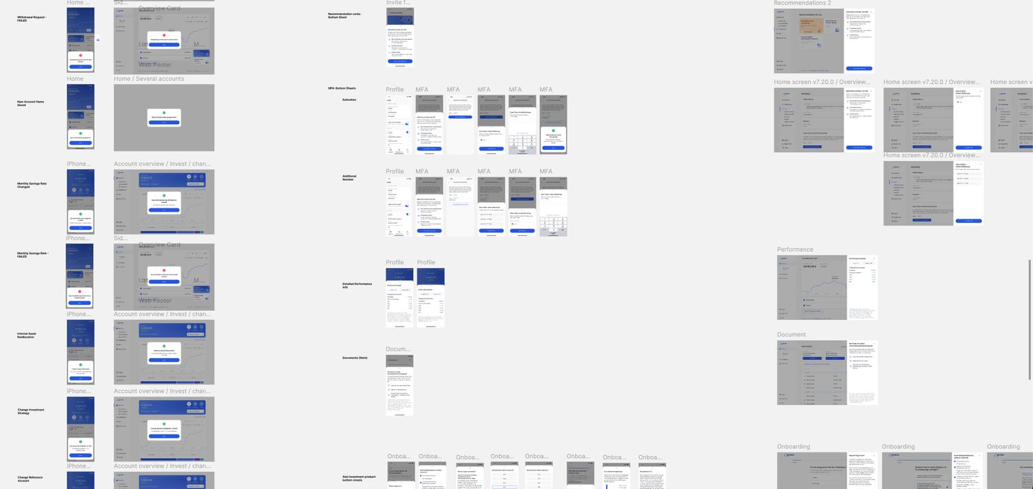
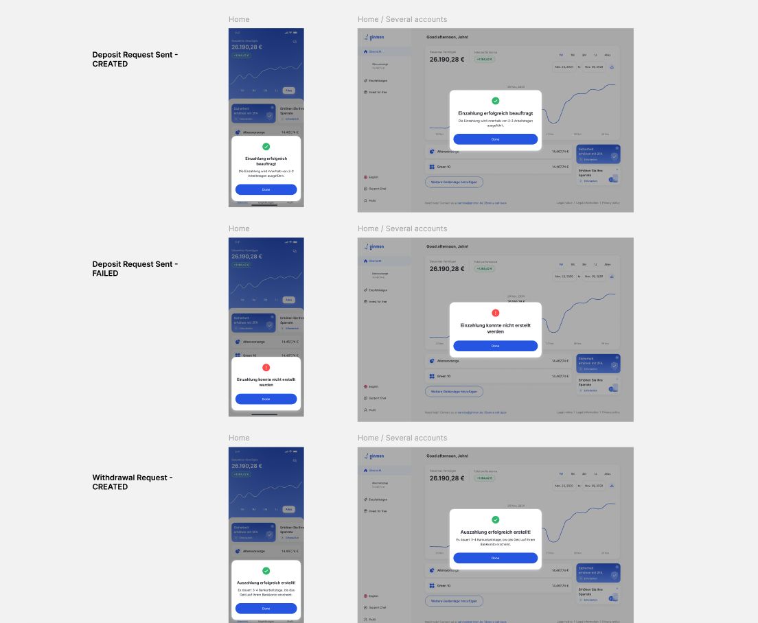
With the framework set and the components built, I designed out every use case the audit had identified — the whole set, on both platforms: logout, deposit and withdrawal states, strategy and reference-account changes, KYC and document uploads, onboarding, performance details, terms and conditions.
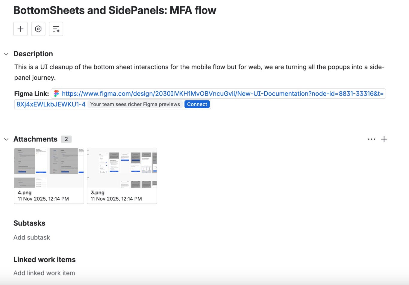
The clearest proof is the flow I started with. MFA had been a multi-step process stranded in a desktop modal, the exact thing the framework says not to do. In the redesign it moves where it belongs: a bottom sheet on mobile, a side panel on web, with the page still visible behind it. System-triggered cases resolved the same way across a whole flow, not just its happy path: a deposit that succeeds is a confirmation modal, the same request failing is an error modal, consistent on both platforms.
07
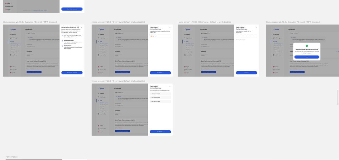
Accessibility. Checked, not claimed.
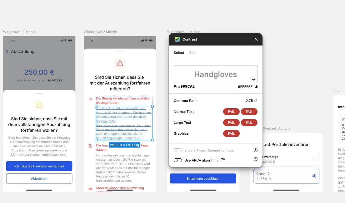
Accessibility was a constraint I measured against real ratios while designing, not a pass at the end. The old withdrawal warning set its body text in red on white at 2.75 to 1, below AA — the kind of thing that reads fine to most and not at all to someone with low vision.
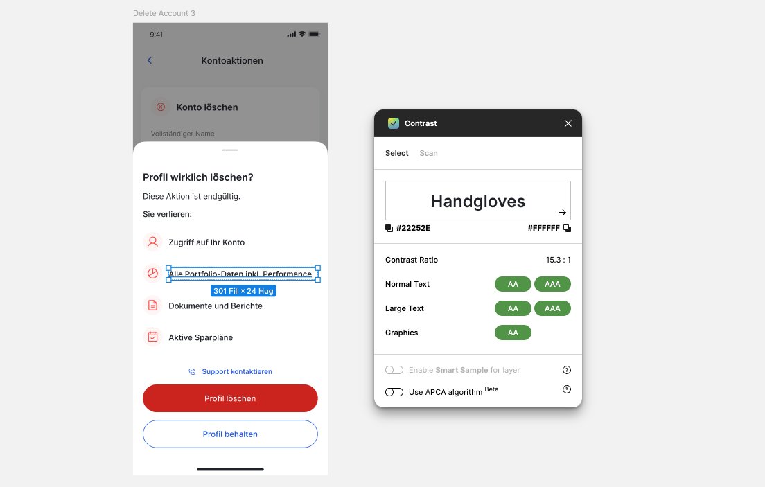
So I worked to a rule: color is not how text carries meaning. A warning gets its severity from its icon and its button, which lets the text itself stay readable. In the rebuilt destructive confirmation the body runs at 15 to 1, comfortably AAA, with red reserved for the action button. And I measured it rather than eyeballed it: overlay text was run through a contrast checker against AA as part of the design, so the standard was built into the component instead of hoped for afterward.
Key decisions
- Color carries emphasis, never meaning, in text
- Severity from icon and button, so copy stays high-contrast
- Contrast measured into the component, not audited late
08
Handoff. Into the build, one flow at a time.
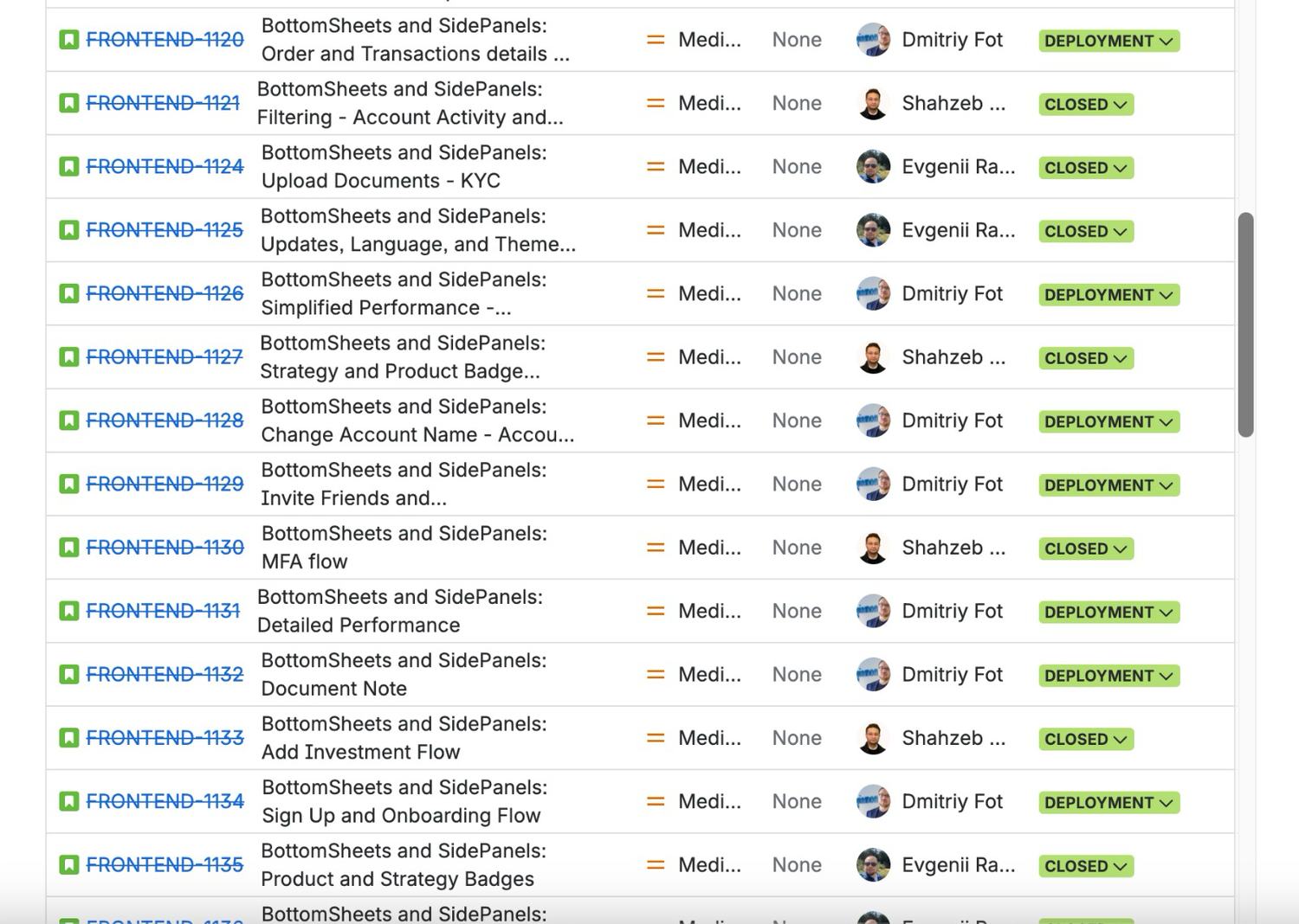
A system only matters if it ships, so I authored the backlog myself: more than thirty tickets, one per use case, organized by surface and scoped tightly. Each carried the Figma link, the mobile and web designs, and the context an engineer needed to build it without guessing.
The exceptions traveled with the work. The terms-and-conditions ticket spelled out in its description that the web treatment was a deliberate one-off due to the volume of text, so it would not be read as a spec error. The components lived in Storybook on the engineering side, and I worked the implementation alongside the developers as they wired up each overlay.
Then I ran design QA on the test environment for every flow. I was the sign-off: I checked each built overlay against its spec, its constraints, and the spacing rules, approved and closed the ones that matched, and sent the rest back for another pass. I created the work, worked the build, and gated the quality at the end.
Key decisions
- Authored the full backlog, one ticket per flow
- Exceptions documented in the ticket, for the engineer
- Design QA on the build, as the sign-off gate
09
Adoption. The right way is the only easy way.
The rules do not have to be policed, because the components do the enforcing. The guidelines are documented — the criteria, the four definitions, and the one rule — but adoption does not depend on anyone remembering them. The components are context-aware and token-aware, with properties for every instance and min and max heights built in, so a designer or developer just changes the content. The on-system choice is the path of least resistance.
That structure paid off somewhere I did not expect. Because the system is documented, tokenized, and consistent, it gives an AI tool the context it needs to get things right. When I prototype in Claude Design, it has the guidelines, the components, and the rules to draw on, so the output comes back accurate to the system instead of approximate. A well-built design system turns out to be the context layer that makes AI-assisted design reliable: the better the system, the better the AI that builds on it.
Key decisions
- Adoption made structural, enforced by the component
- A documented standard anyone can apply
- The system as the context that makes AI prototyping accurate
Reflection
The overlays that started as a scattered mess now trace back to one decision, one set of components, and one documented standard. The project set out to fix an inconsistency users could feel, and a user left a review saying the app experience keeps getting better.
The lesson I keep from it is that the hardest and most valuable work here was subtraction: turning a correct but complex flowchart into a single question a busy team would actually use. A system survives contact with reality not by having no exceptions, but by making them visible and reasoned. And there is a next iteration already, moving the components onto Figma's new Slots feature for tighter control and broader coverage, so instances stay attached to the system instead of being detached and rebuilt. A system like this is never finished; it earns its keep by getting harder to break over time.
Interested in working together? Get in touch.