Modernizing the user experience for a German wealth management platform
Lead product designer at Ginmon (Germany). I redesigned core flows in the consumer investment app so the experience feels clear and trustworthy.
- Company
- Ginmon (B2C product)
- Industry
- FinTech / Wealth Management
- Role
- Lead Product Designer
- Platforms
- Web & Mobile (iOS, Android)
- Key areas
- Home, Account Overview, Documents, Profile
Goal
The app helps people invest via automated portfolios. The product had grown over the years; the experience needed to feel as trustworthy and professional as the brand.
Challenge
Inconsistent UI, cluttered layouts, and weak hierarchy. Profile and settings were merged into one messy area. I modernized the main flows and brought the product in line with what users expect from apps like Revolut and Wise.
Outcome
I improved four core areas. The app is clearer and faster to use. Key actions (deposits, withdrawals, savings rate) are easy to find and do. Portfolio value and performance are visible at a glance.
core flows redesigned
platforms (web & mobile)
01
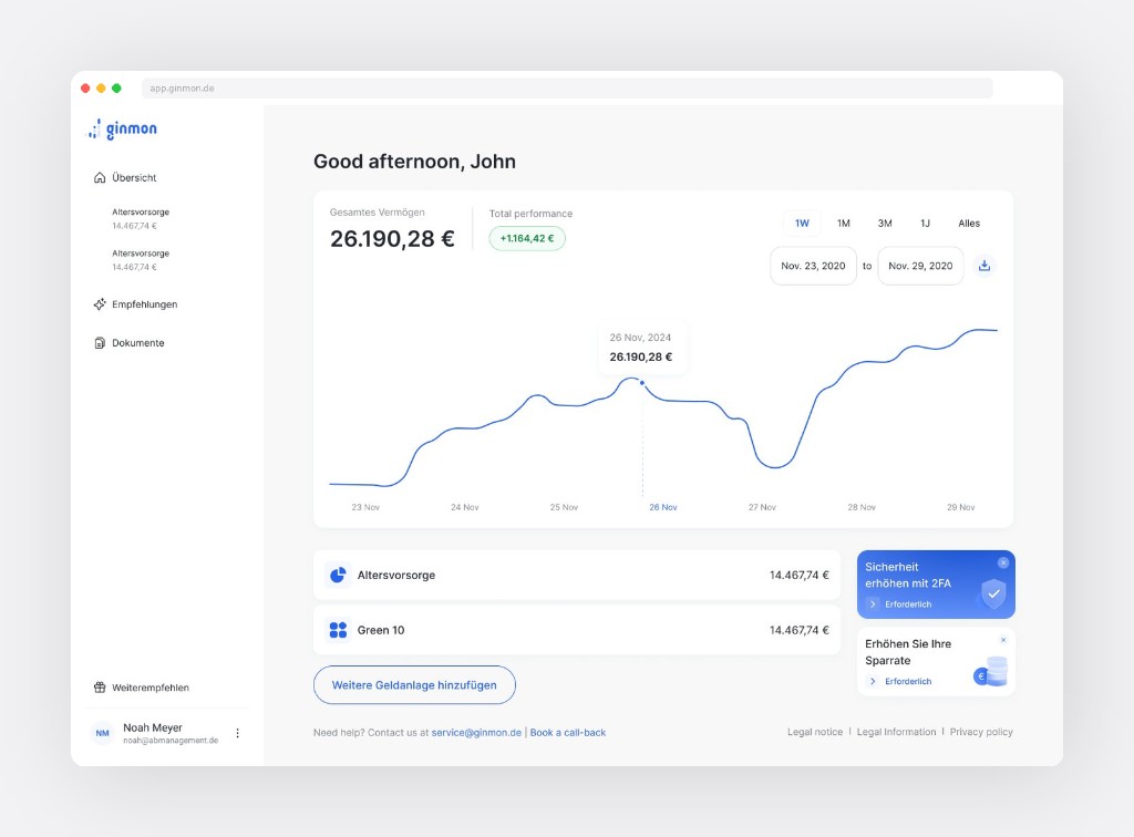
Home. Portfolio dashboard
The home screen was cluttered. I put total value and performance at the top, added a clear chart with tooltip, and made account cards scannable. Secondary stuff (security prompts, savings nudge) moved to the sidebar so it doesn't compete.
Key improvements
- Value and performance first (e.g. 26.190,28 €, +1.164,42 €)
- Simple portfolio list with consistent cards
- Time filters (1W, 1M, 3M, 1J) and chart tooltip
- Recommendations in sidebar, not in the way
02
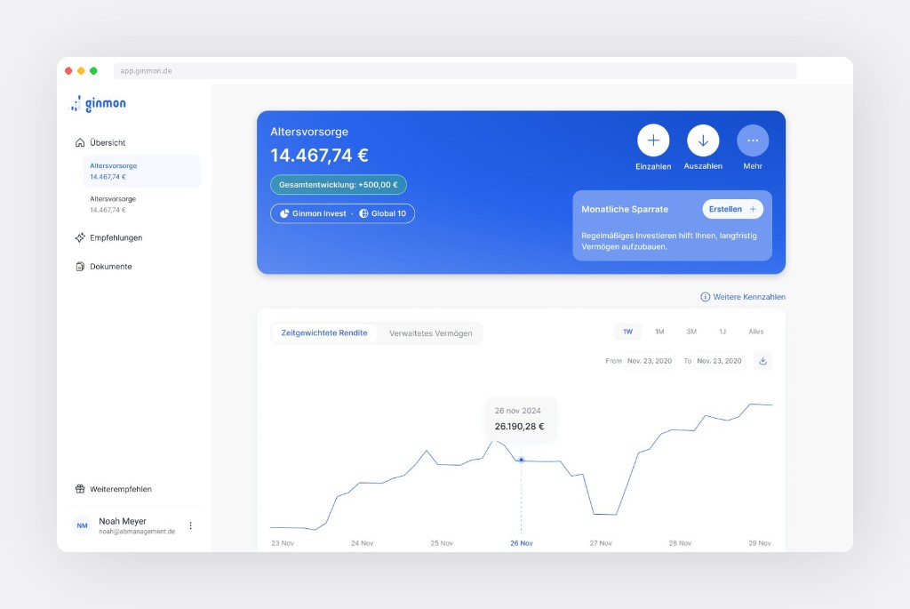
Account overview. Core experience
Where users spend most of their time. The old design hid key actions. I added a hero block that answers: How much? How's it doing? What can I do? Deposit, withdraw, and more are always visible at the top.
Key improvements
- Hero card with value, performance badge, product tags
- Primary actions as icon buttons, always reachable
- Savings rate nudge in the hero
- Dual-view chart (return vs. managed assets), time filters
- Projection and allocation by priority
03
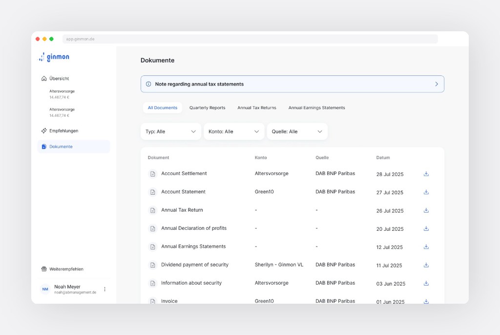
Documents
Documents were hard to find and search. I redesigned the layout with a clear table, filters by type, account, and source. A top banner surfaces time-sensitive items (e.g. tax statement ready) so users don't have to dig.
Key improvements
- In main nav for quick access
- Tabs: all docs, quarterly, tax, earnings
- Dropdowns for type, account, source
- Table with download on each row; info banner when needed
04
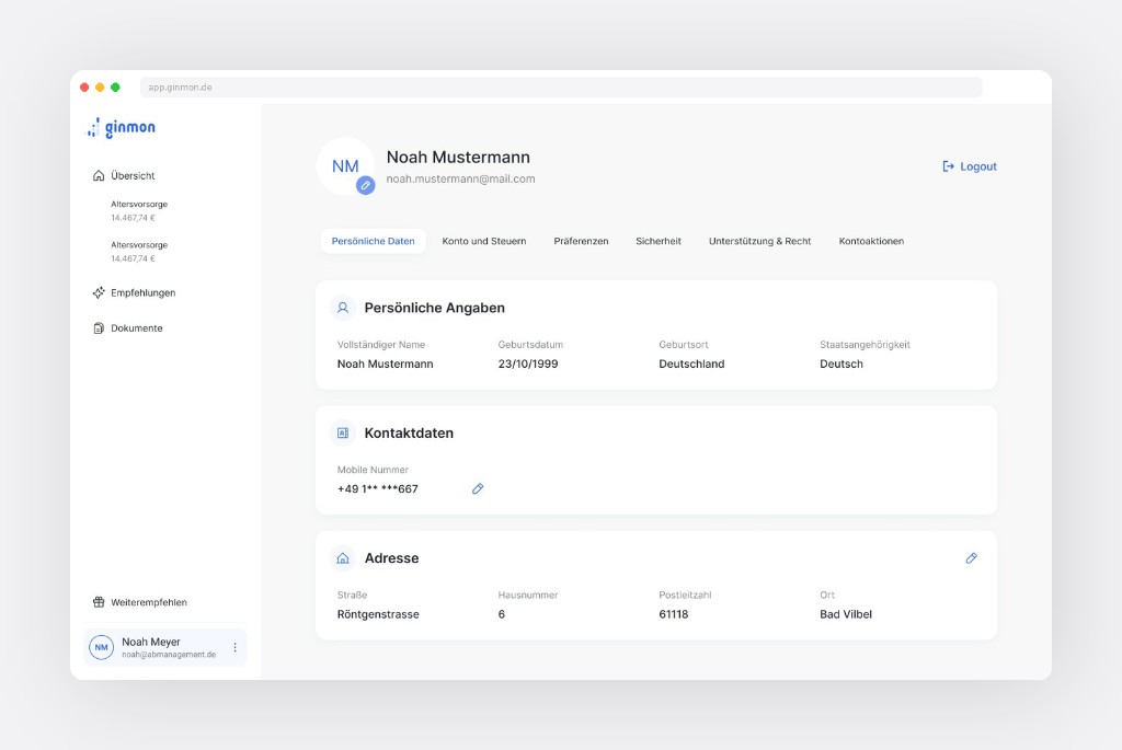
Profile. From chaos to clarity
Profile was a catch-all: settings, personal info, security, legal, contacts all in one messy view. I looked at Revolut and Wise, then split it into clear tabs: personal data, tax, preferences, security, support.
Key improvements
- Identity at top: avatar, name, email, logout
- Six tabs, each with a focused view
- Personal info and address in scannable cards; edit inline
Reflection
Small, focused changes can shift how people feel about a product. I didn't rework everything: I fixed what mattered first. The design system (documented separately) gave a consistent base so the product is better now and easier to change later.
Interested in working together? Get in touch.