Design System
One tokenised source of truth for Ginmon's app and web.
Ginmon ran on two parallel design languages, one for mobile and one for web, maintained by hand and drifting apart screen by screen. I rebuilt the foundation as a single tokenised system on an atomic model, so one component renders correctly across web and mobile and light and dark without a second copy. Here's how it came together, from audit to organisms.
- Role
- Product Designer, design system
- Company
- Ginmon
- Surface
- B2C app and web
- Built with
- Figma variables, atomic structure, Storybook handoff
01
Audit. Get the truth on the table
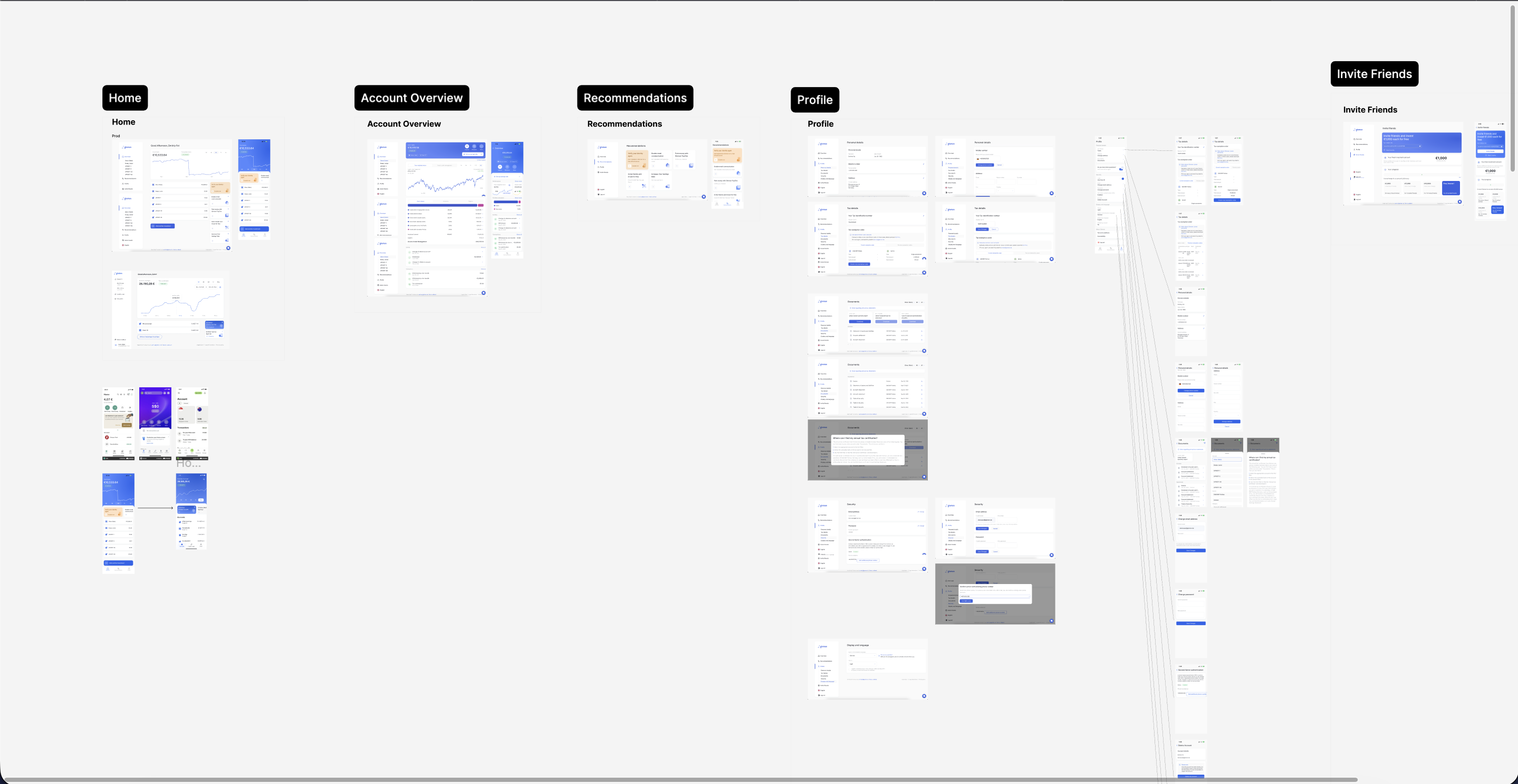
Before touching a token, I inventoried the live product, every screen across Home, Account Overview, Recommendations, Profile, and the smaller flows. Laying it all out in one place surfaced the real pattern library hiding in production: which components actually recur, which ones quietly forked into near-duplicates, and which interactions carry the most weight. I prioritised the build from there, by recurrence, importance, and usage, so the system started with the parts the product leans on daily rather than the parts that were fun to draw.
Key decisions
- Inventory the live product first, not the ideal one
- Prioritise by recurrence, importance, and real usage
- Treat near-duplicate components as one job, not many
02
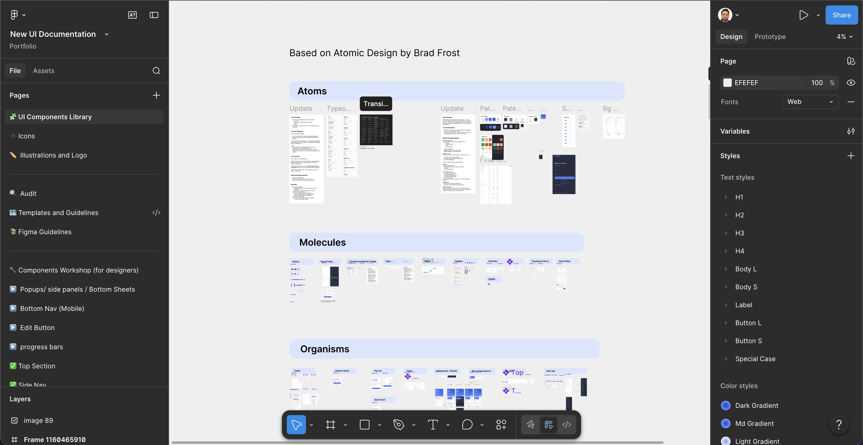
Structure. Atomic by design
I built the library on Brad Frost's atomic model so the system would compose instead of sprawl. Atoms hold the fundamentals as variables, molecules are the working components like buttons, inputs, and tabs, and organisms combine those into the larger, product-specific pieces. The file mirrors this: one UI Components Library as the source of truth, with separate Components Workshop and Guidelines pages where ideas get drafted and pressure-tested. Nothing reaches the library until it's approved, then it's promoted in. That keeps the published system clean while leaving room to think out loud.
Key decisions
- Atoms, molecules, organisms as the spine of the file
- One published library as the single source of truth
- A workshop-to-library pipeline so drafts never reach production
03
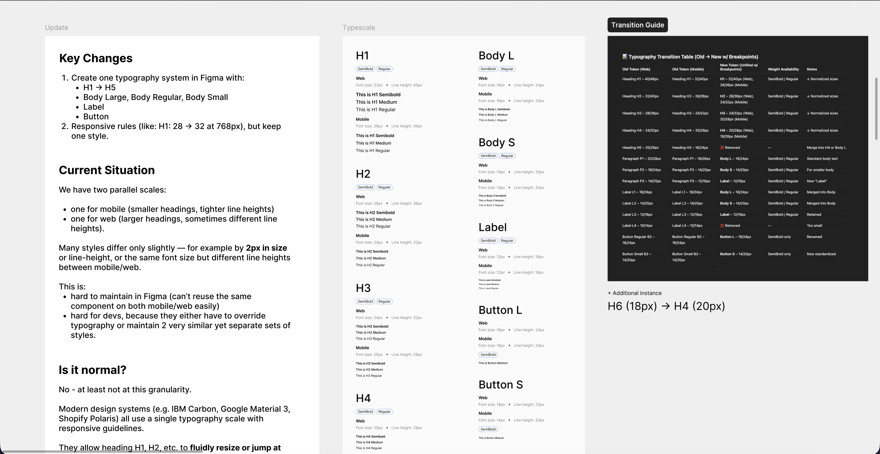
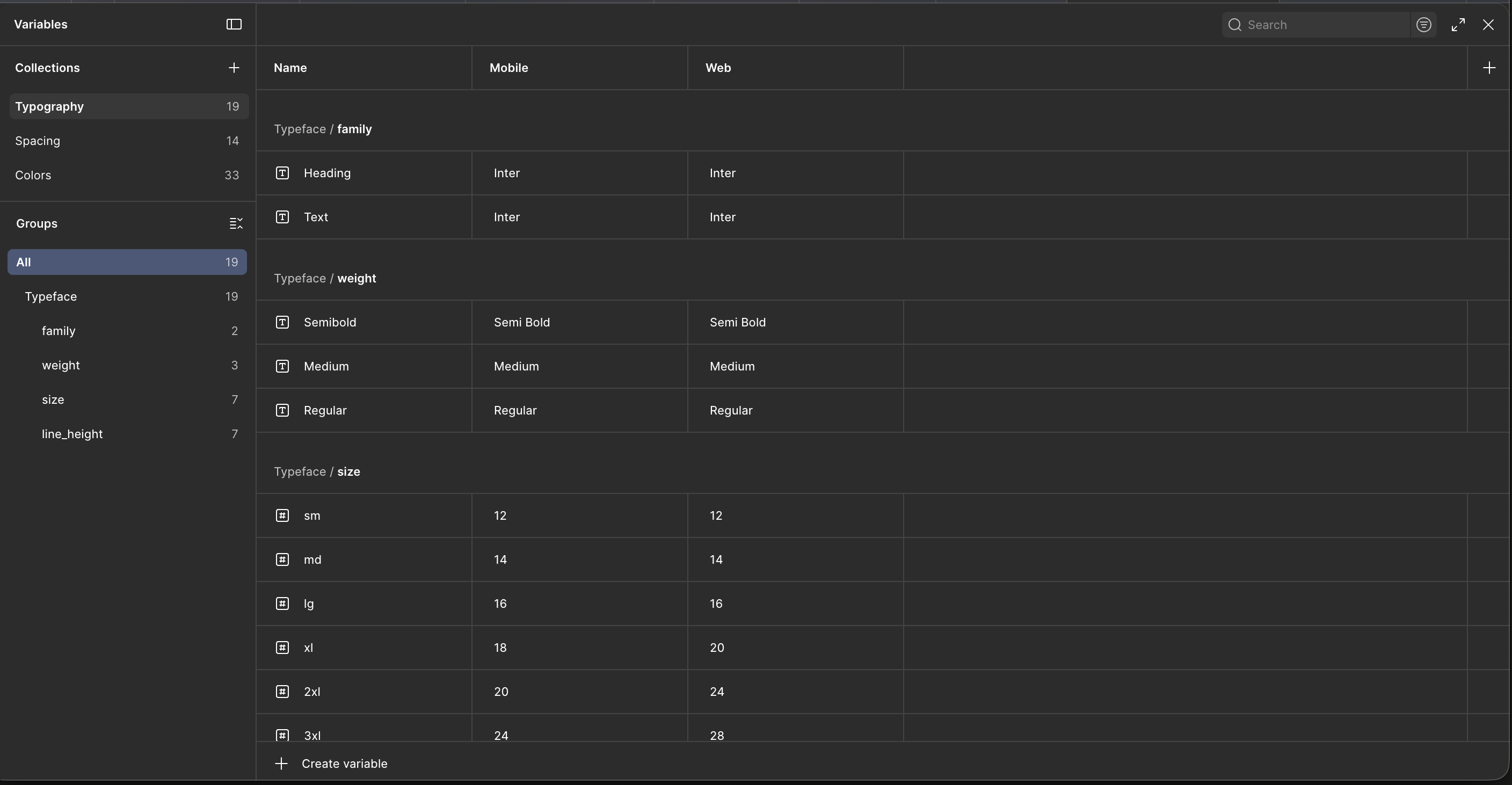
Type. One scale, both platforms
We were carrying two typography scales, one mobile and one web, that differed by as little as a couple of pixels in size or line height. It was hard to maintain in Figma and worse for engineering, who had to either override type or keep two near-identical sets in sync. I collapsed it into a single system, H1 through H4 plus Body, Label, and Button, with responsive rules instead of a parallel scale. To make the change safe, I wrote a transition guide mapping every old token, web and mobile, to its new unified token, so nobody had to migrate by guessing. Carbon, Material 3, and Polaris all work this way; this brought us in line.
Key decisions
- Collapse two scales into one responsive system
- Inter at a 14px base for density in a data-heavy product
- Ship a full old-to-new transition map so migration isn't guesswork
04
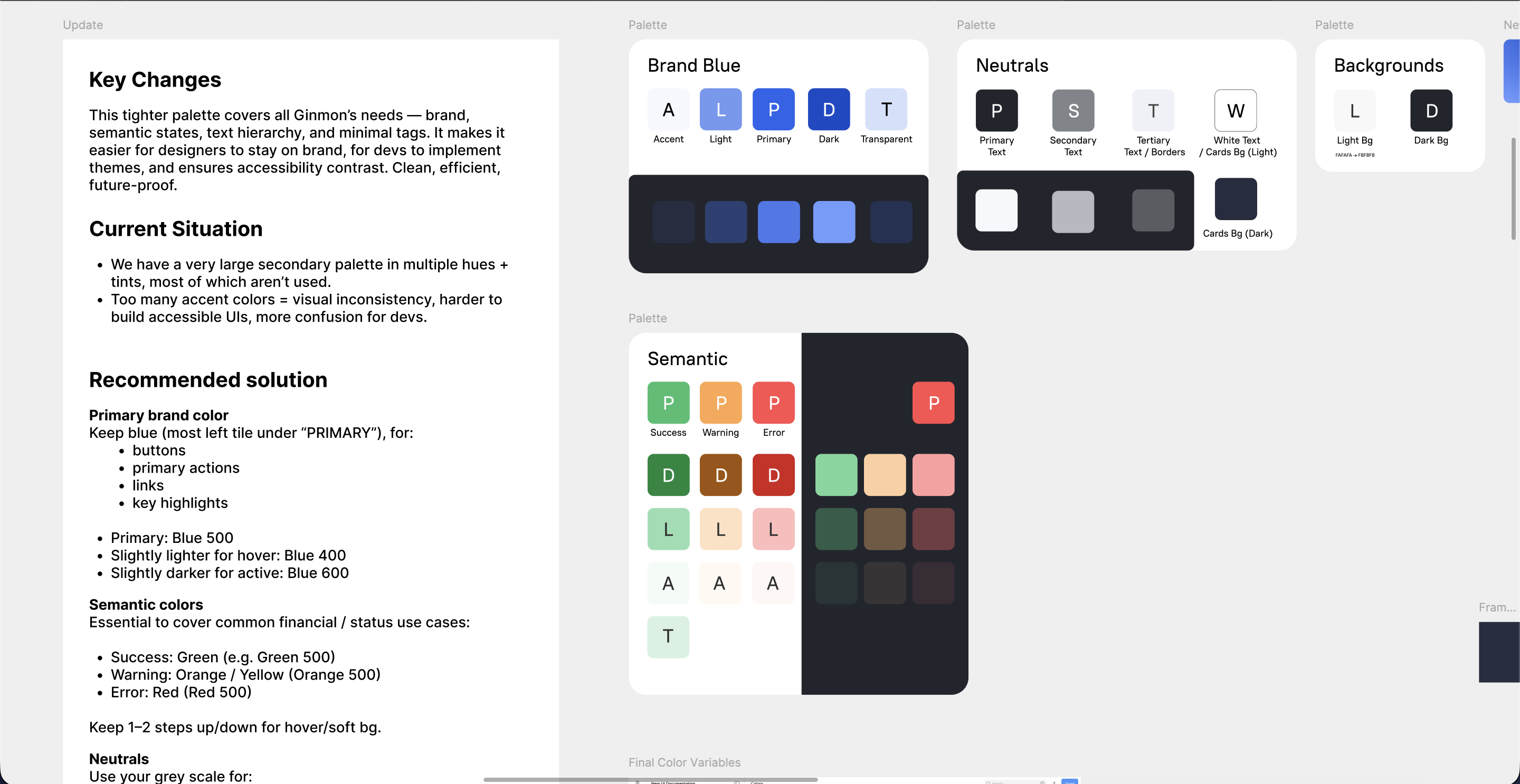
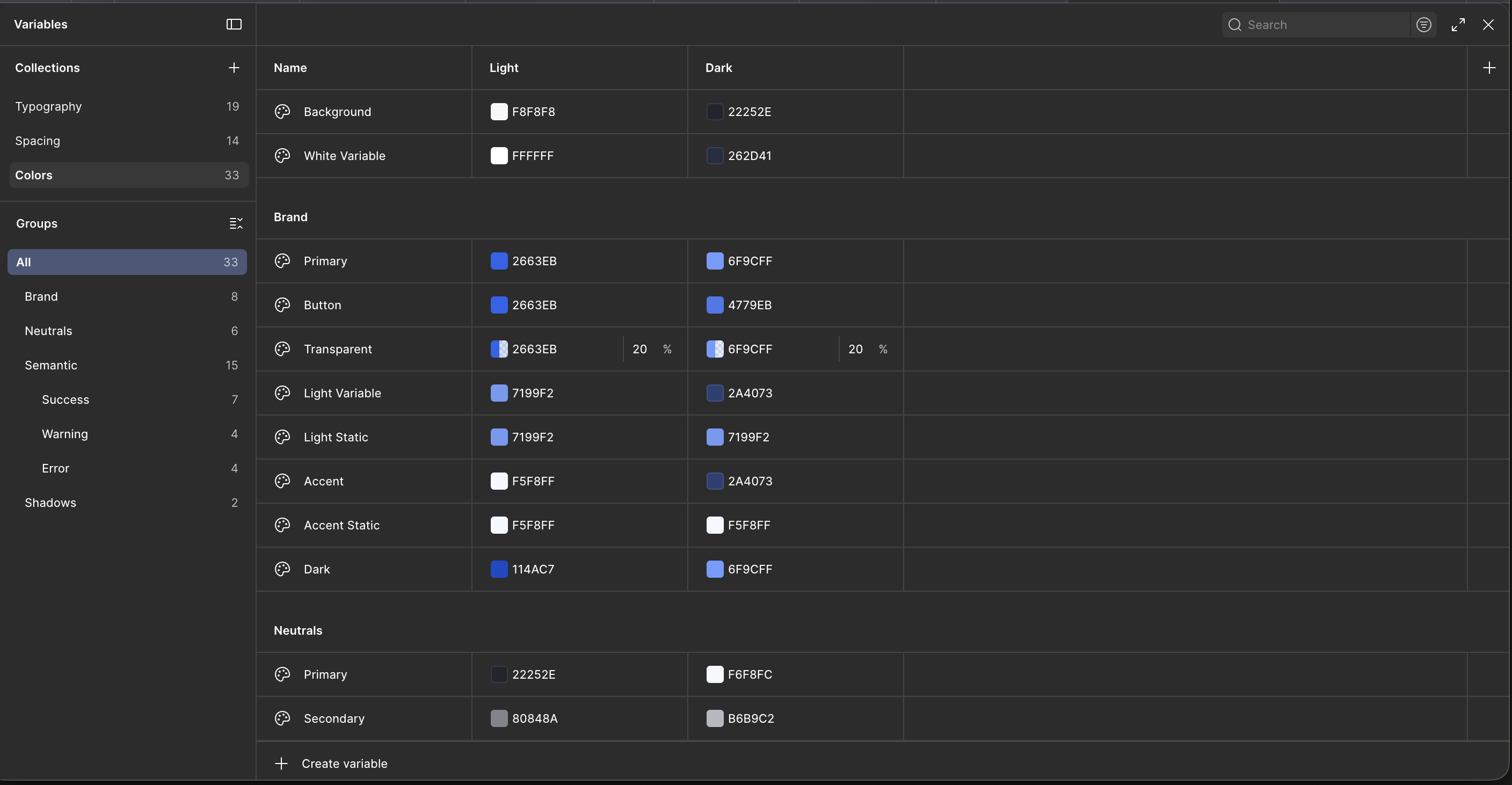
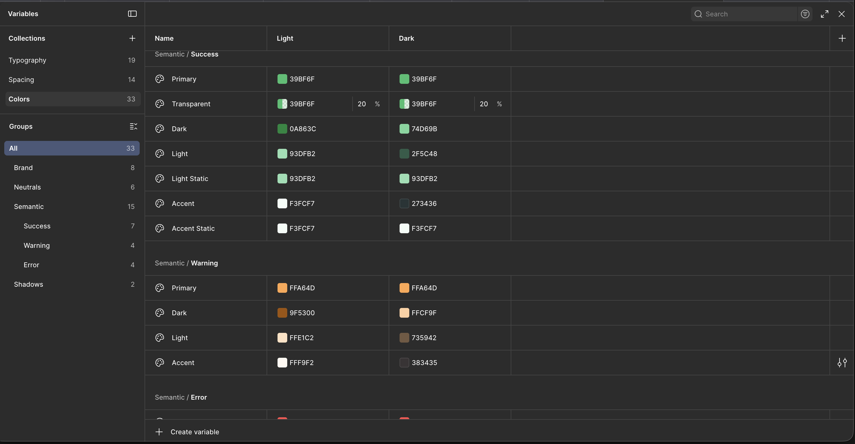
Color. Fewer colors, more meaning
The old palette was huge, multiple hues and tints, most unused, which made it easy to drift off brand and hard to build accessible UI. I cut it to what Ginmon actually needs: brand blue for primary actions, links, and key highlights, a neutral grey scale for text and surfaces, and a tight semantic set for success, warning, and error, each with a step up and down for hover and soft backgrounds. Every value is paired for light and dark and verified for AA contrast. The result is a palette small enough to stay consistent and complete enough to cover real financial states.
Key decisions
- One brand blue for actions, links, and highlights
- Semantic colors scoped to financial states, not decoration
- Every token paired for light and dark, AA contrast verified
05
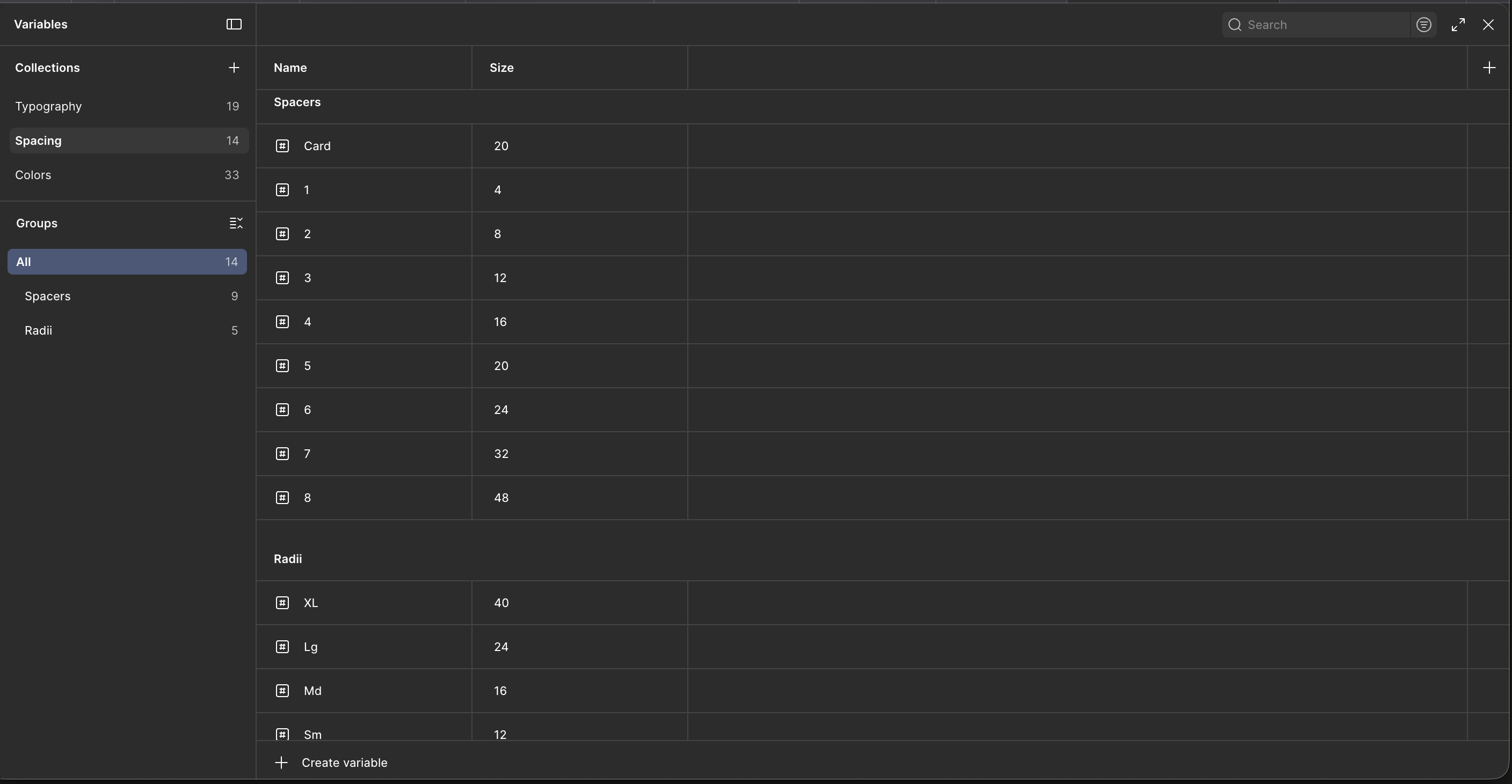
Tokens. Context aware by default
This is where the system earns its keep. I defined the fundamentals, typography, spacing, and color, as Figma variables rather than static styles, because variables switch on context and styles can't. Type and spacing carry separate values for mobile and web inside the same token; color carries separate values for light and dark. One component references the token and renders correctly in every context, with no duplicate built per breakpoint or theme. Typography sits on a t-shirt scale, spacing on a 4px grid with named radii, and color splits into brand, neutral, and semantic groups. The same variables flow straight into the Storybook implementation, so design and code share one definition.
Key decisions
- Variables over styles so tokens adapt to context
- Mobile and web values held in one type and spacing token
- Light and dark values held in one color token
- Same tokens power Figma and the Storybook build
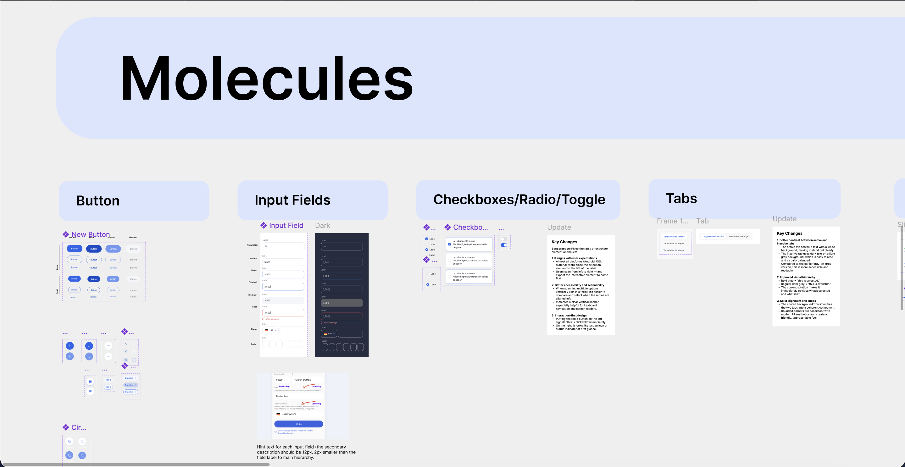
06
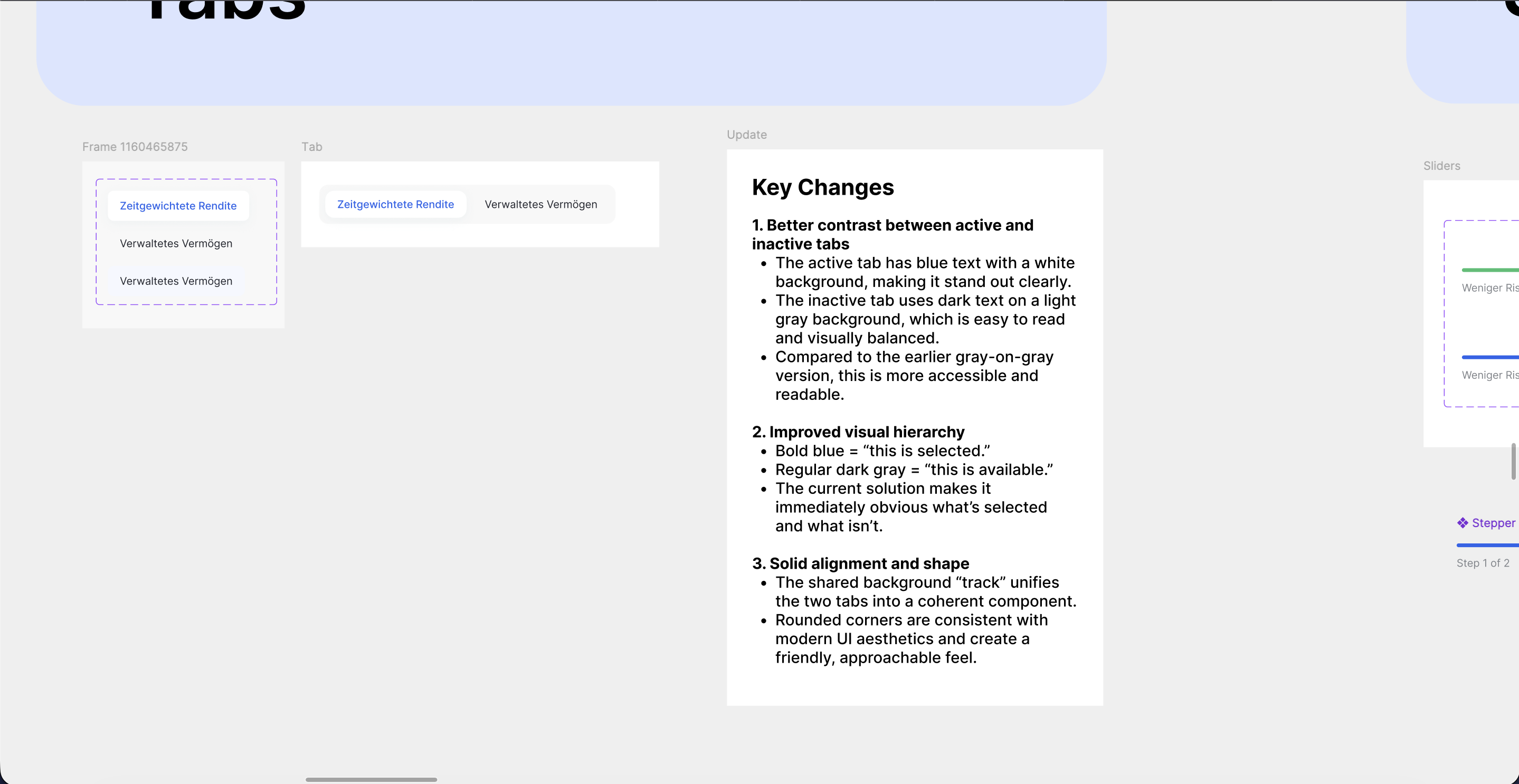
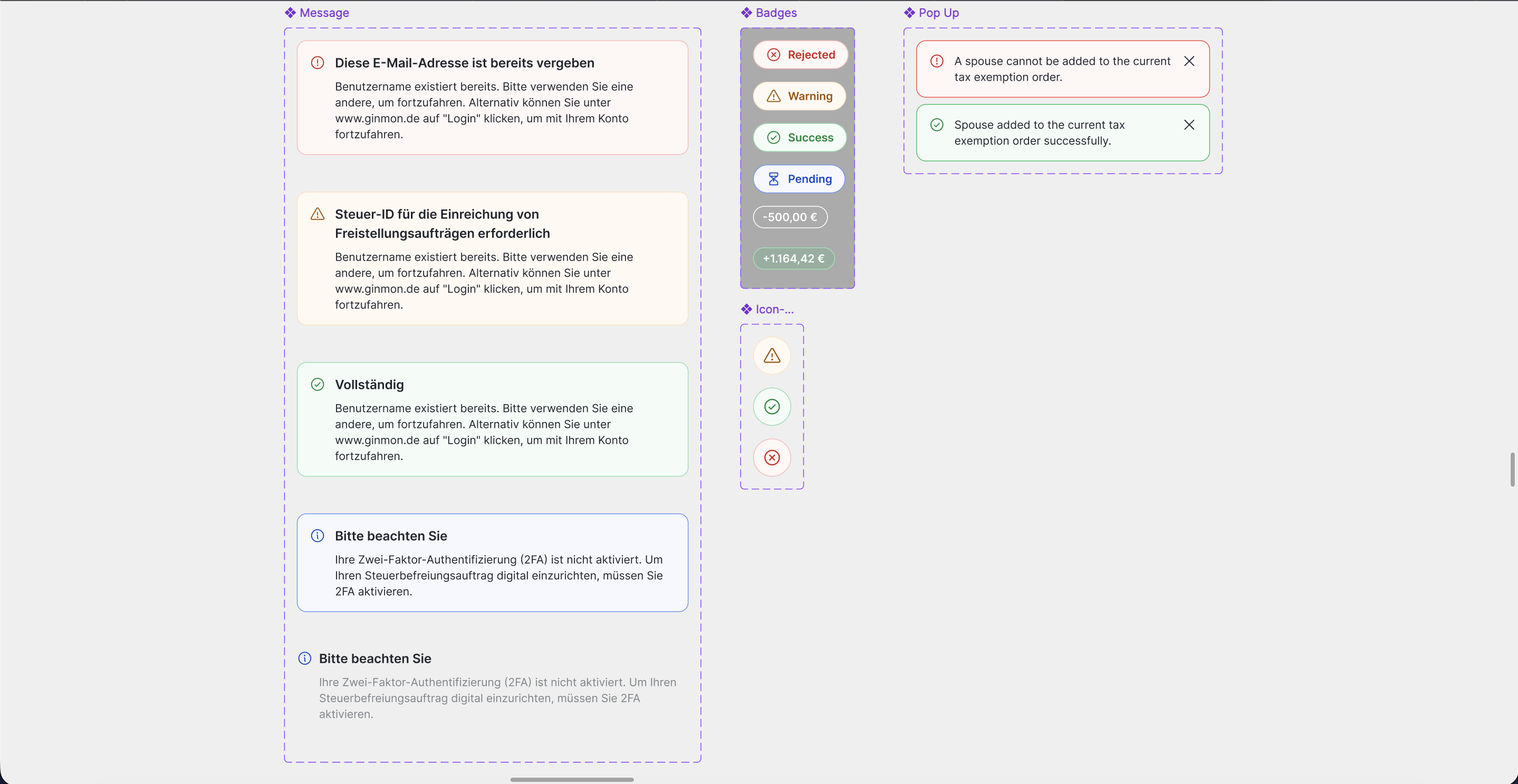
Molecules. Components with every state
With the foundations set, I built the working components and gave each one its full range: default, hover, focus, pressed, disabled, error. Product teams assemble screens instead of reinventing states. Buttons, inputs, checkboxes, radios, toggles, tabs, badges, and messages all ship as variant-driven components on the tokens, each with a short rationale beside it. Tabs are a good example: I moved the active state to blue text on white and the inactive to dark text on light grey, because bold blue reads as “this is selected” and the shared track ties the set into one control. Small calls, but documenting the why is what keeps a system from being re-litigated every sprint.
Key decisions
- Every component ships with its full state set
- Variant-driven, built entirely on tokens
- A short rationale travels with each component so decisions stick
07
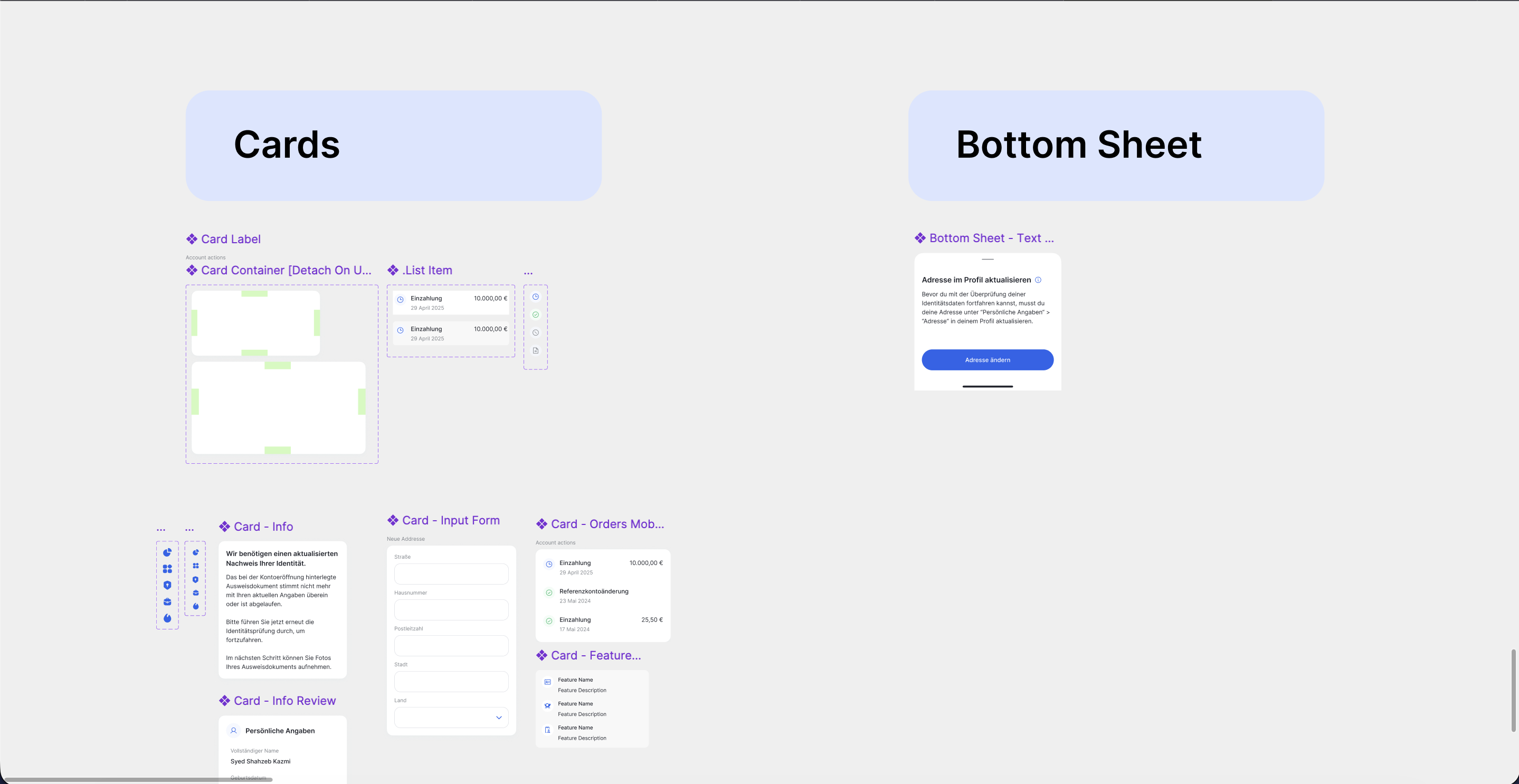
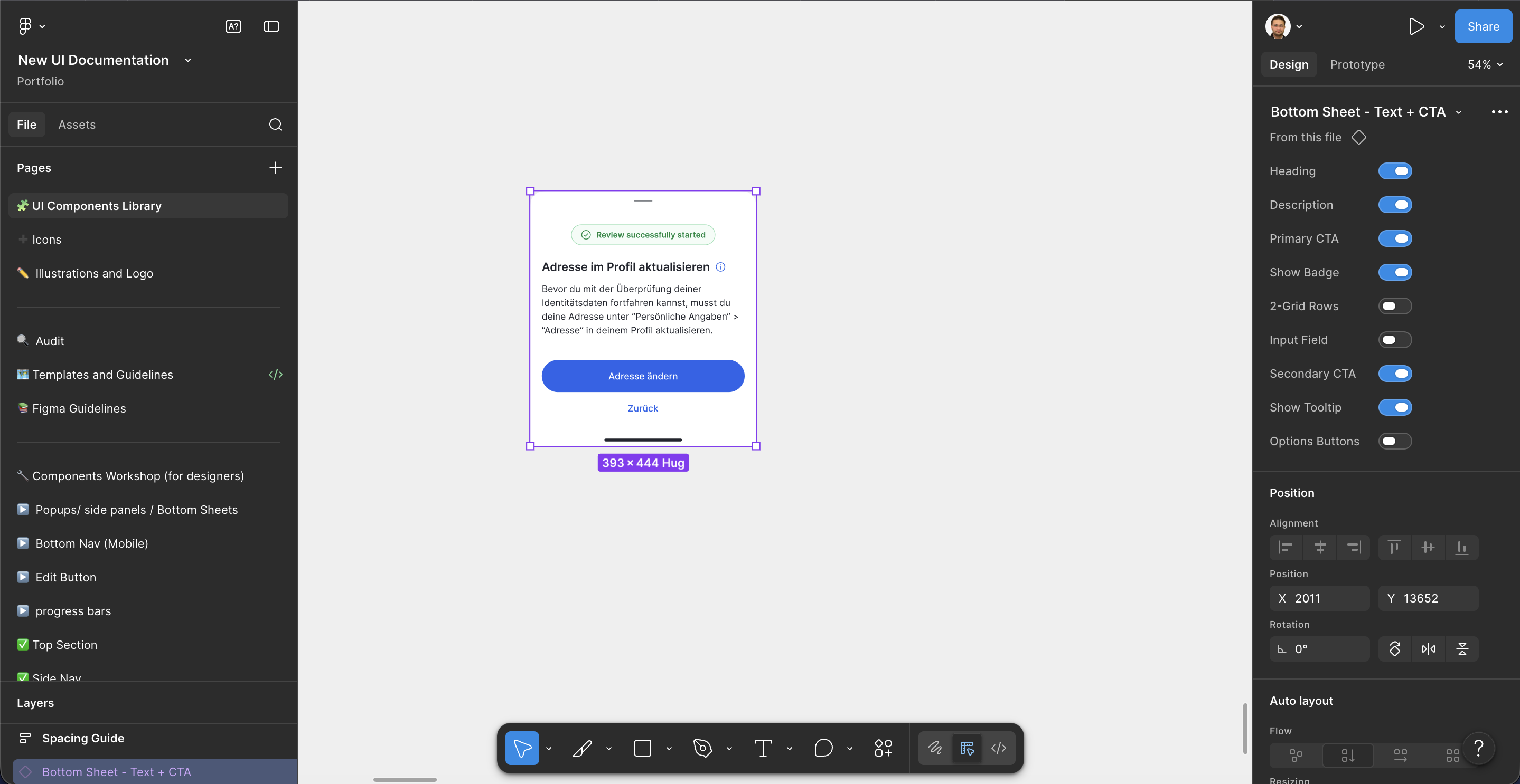
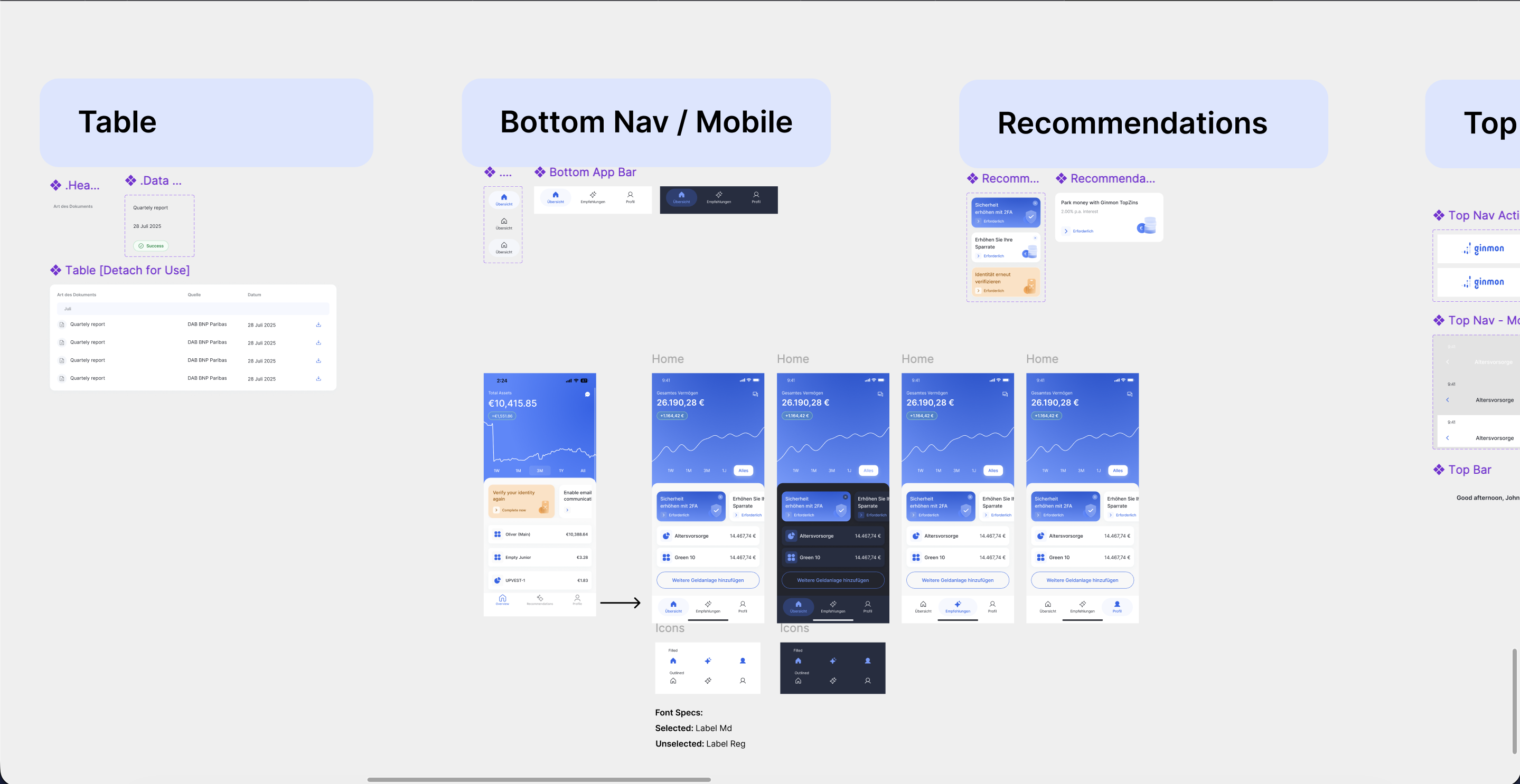
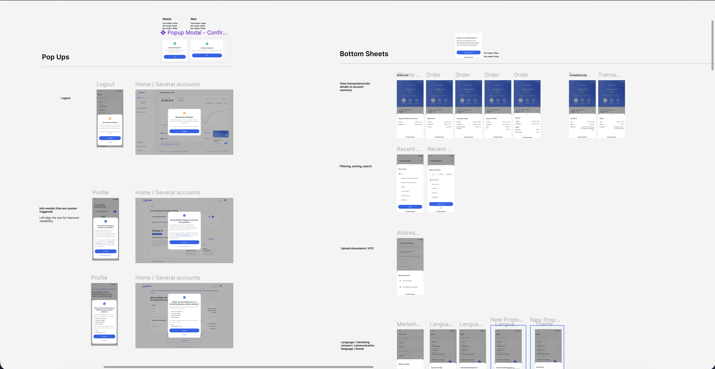
Organisms. Product specific, configurable
Organisms are where molecules combine into the pieces the product actually ships: cards, tables, bottom sheets, top and bottom navigation. These lean product-specific, so I built them to be configured rather than copied. The bottom sheet is the clearest case, a single component with properties to toggle the heading, description, badge, input field, primary and secondary actions, tooltip, and layout. One component covers a dozen real situations. Cards, list items, and tables follow the same logic, with detachable containers for the cases that genuinely need to break out. By this layer the system is doing the work: nav, tables, and sheets are assembled from the same atoms and molecules, consistent by construction.
Key decisions
- Configurable components over per-screen copies
- Component properties to flex one organism across many cases
- Detachable containers for the genuine one-offs
Reflection
The system replaced two drifting design languages with one tokenised source of truth that holds across web and mobile and light and dark, and hands cleanly to engineering through Storybook. Designers compose from approved parts instead of redrawing them, developers build against the same tokens designers use, and new patterns have a clear path from workshop to published library. The audit set the priorities, the atomic structure kept it composable, and variables made it adapt. Those three choices are what turned a pile of screens into a system.
Interested in working together? Get in touch.